Project Type
Logo Designs
Branding
Brand Development
My Role
Project Management
Creative Direction
Art Direction
Production
OVERVIEW
I’ve had the opportunity to develop logos as well as expand on visual identities for a diverse range of clients, from small businesses and creative ventures to established organizations. Each project begins with understanding the client’s story, audience, goals, and personality, then translating those insights into a visual identity that feels both distinctive and authentic.
My approach to brand development goes beyond creating a logo. I consider how typography, color, imagery, and graphic elements work together to create a cohesive visual language that can grow with a brand and translate across a variety of applications—from print and digital materials to social media, packaging, merchandise, and environmental graphics.
The projects featured here showcase a range of visual styles and approaches, reflecting my belief that effective branding should be thoughtfully tailored to each client rather than built from a one-size-fits-all formula.
SUMMARY
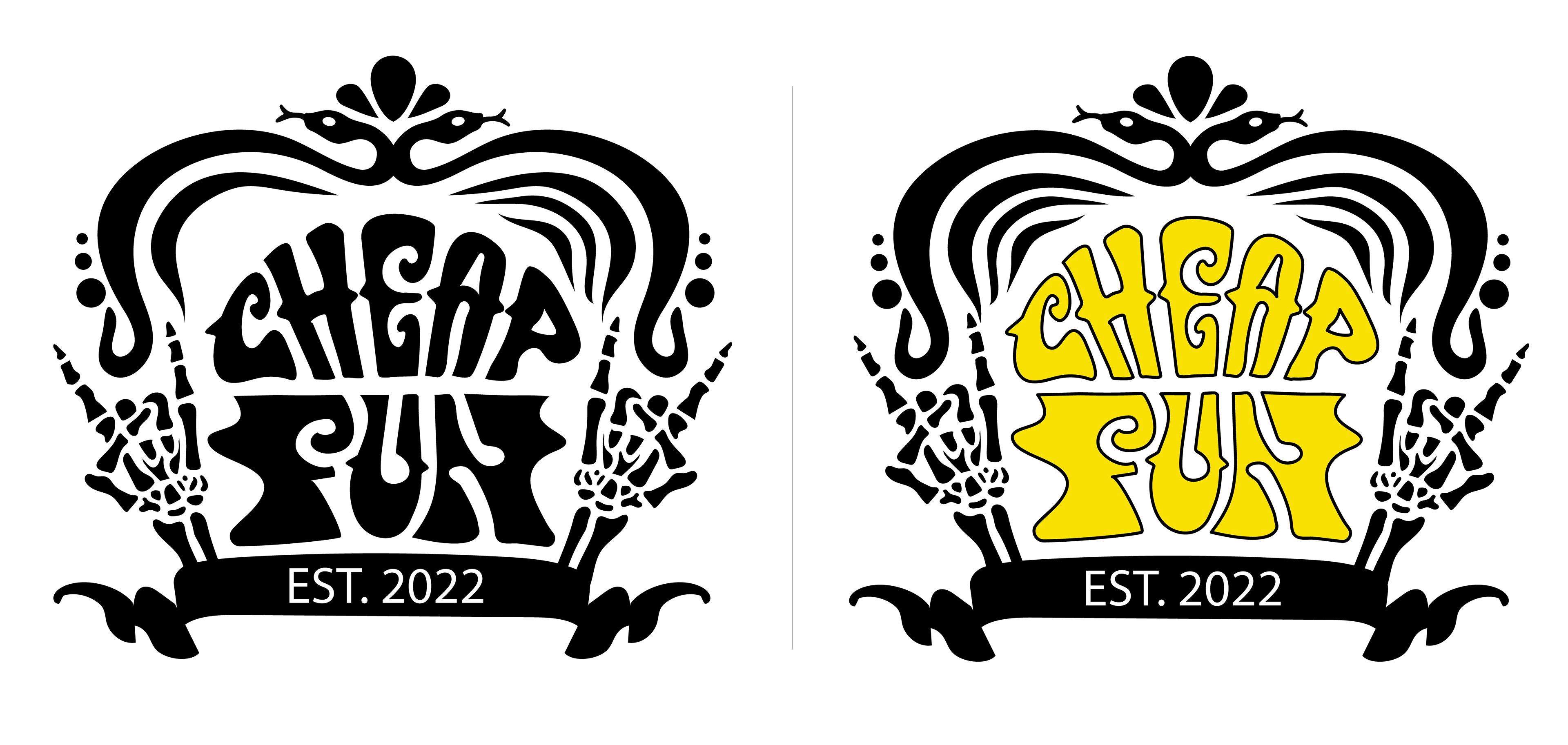
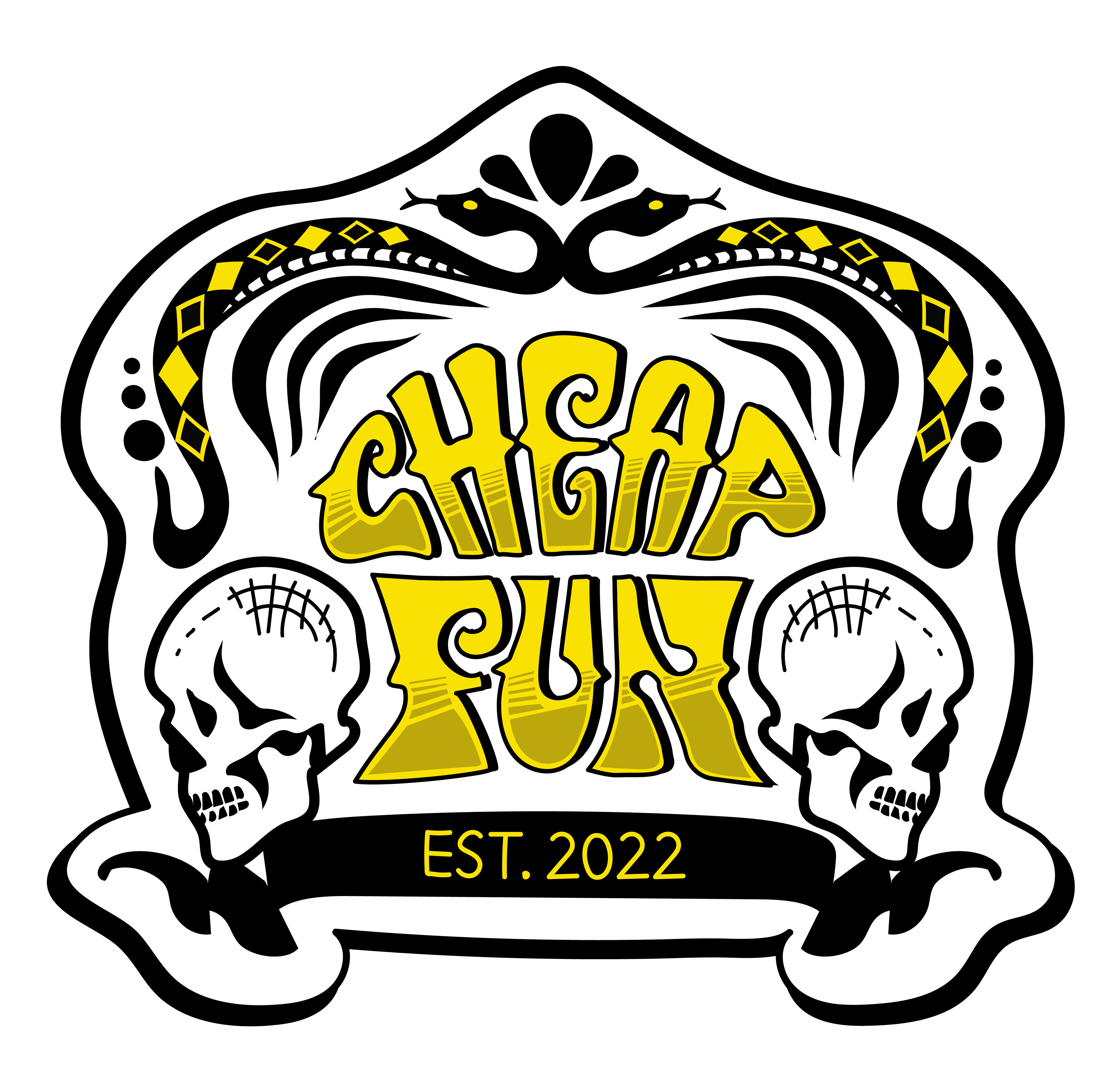
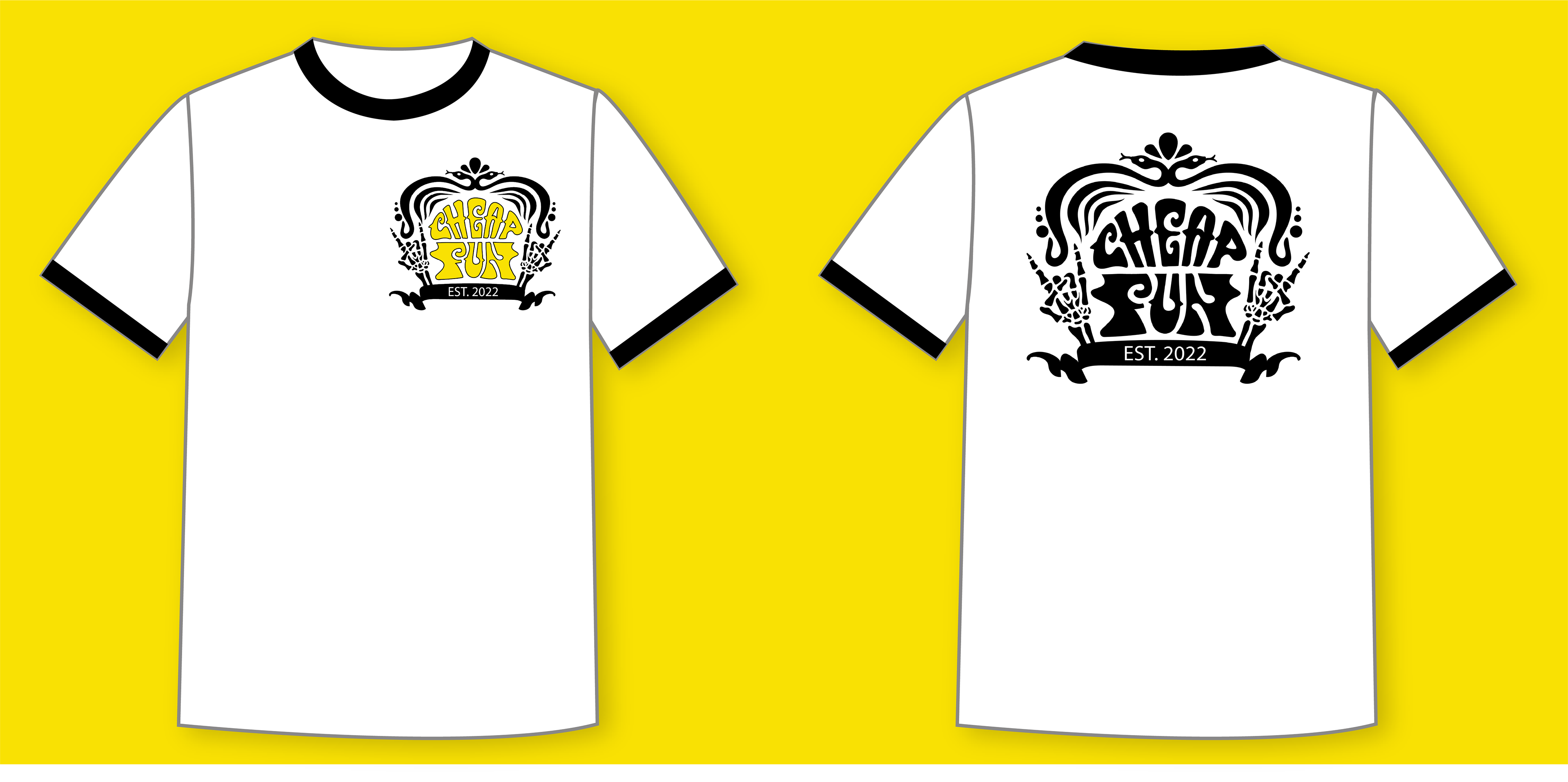
I worked closely with Seattle-based rock band Cheap Fun to develop a distinctive logo system that reflected their playful, retro-inspired sound and personality. The band came to the project with a clear visual direction, drawing inspiration from the classic lettering of the Cheers logo and the bold, hand-drawn aesthetic of vintage rockabilly tattoo art.
The challenge was to capture the character and nostalgia of these influences without falling into predictable rockabilly clichés. I explored custom lettering, vintage-inspired forms, and several distinct visual approaches, ultimately presenting three logo concepts. The band loved each direction so much that they chose to use all three, creating a flexible logo system that could be adapted across different applications while maintaining a cohesive visual identity.
The resulting designs balance nostalgia with personality, giving Cheap Fun a collection of logos that feels authentic to their musical style while remaining fresh, recognizable, and uniquely their own.
MEDIUM
Paper / Graphite / Adobe Illustrator
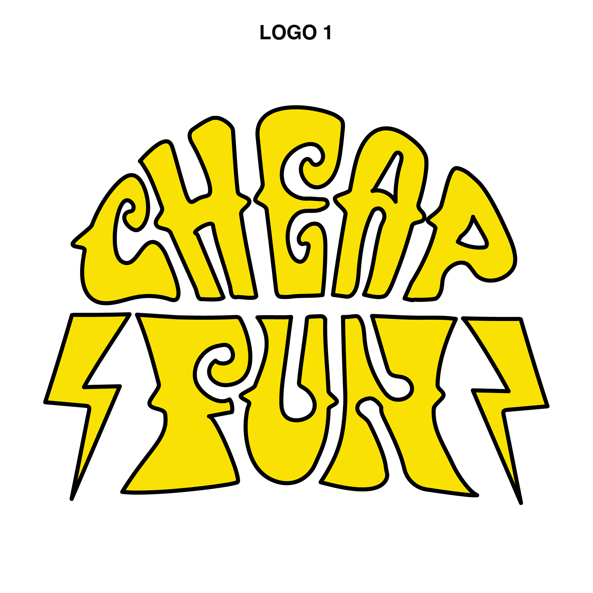
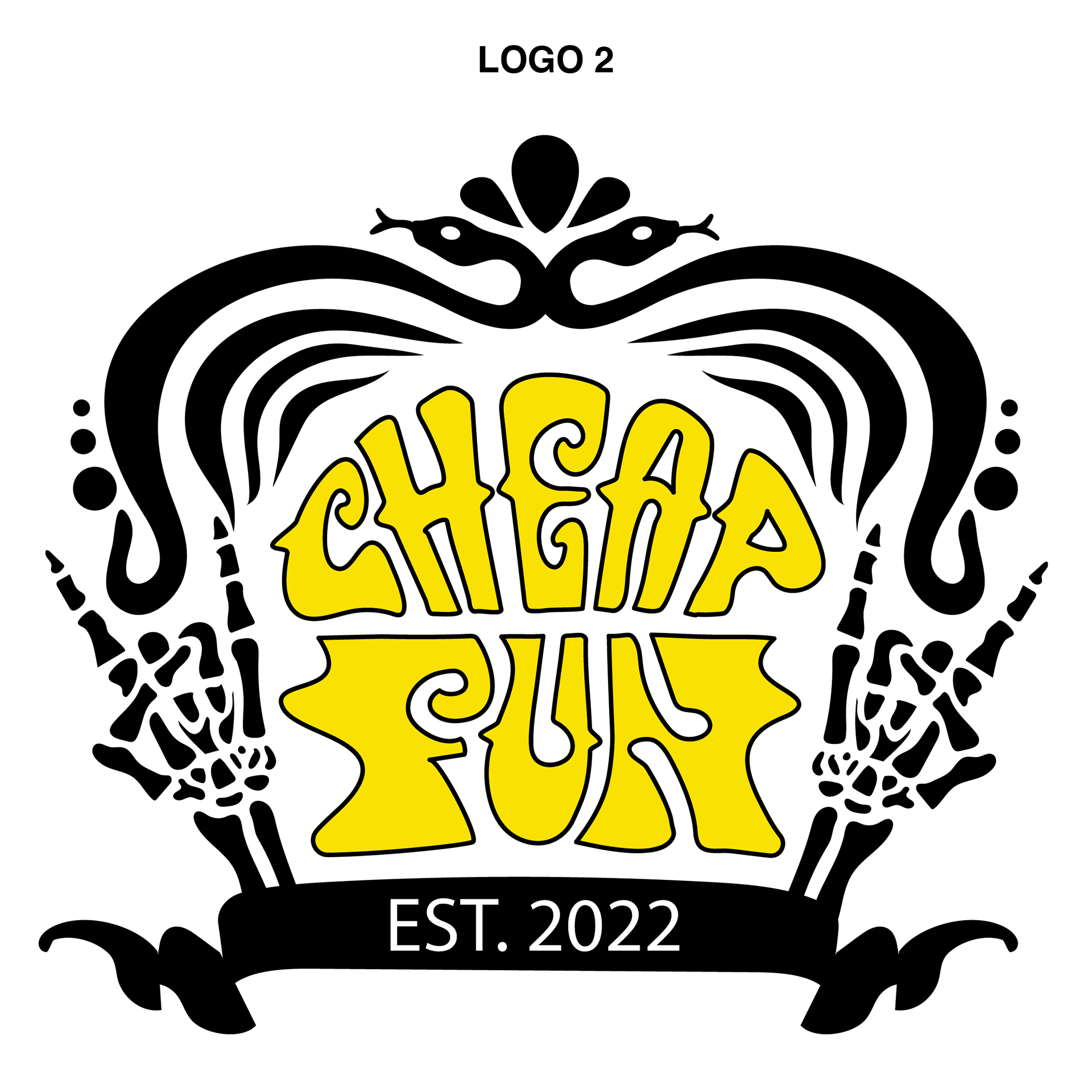
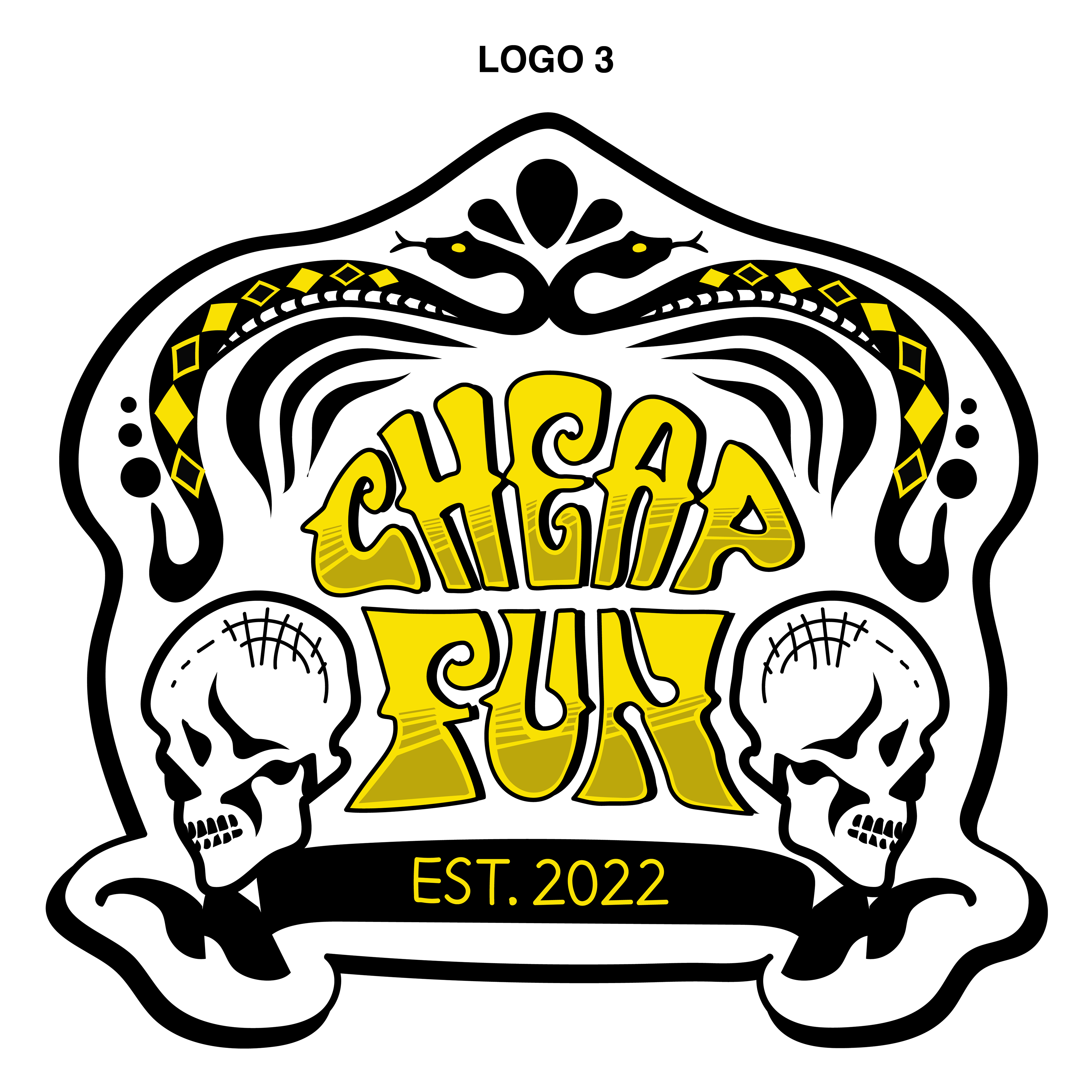
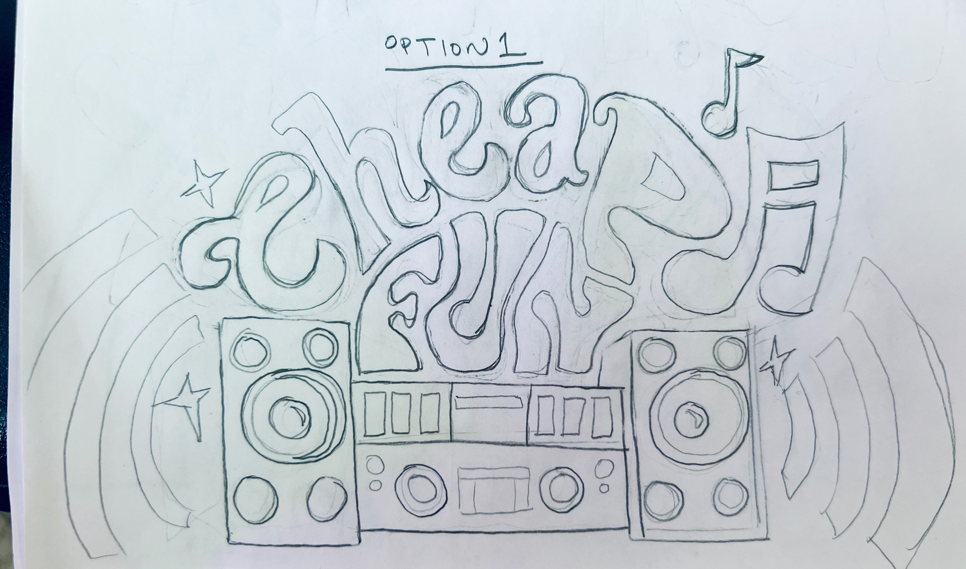
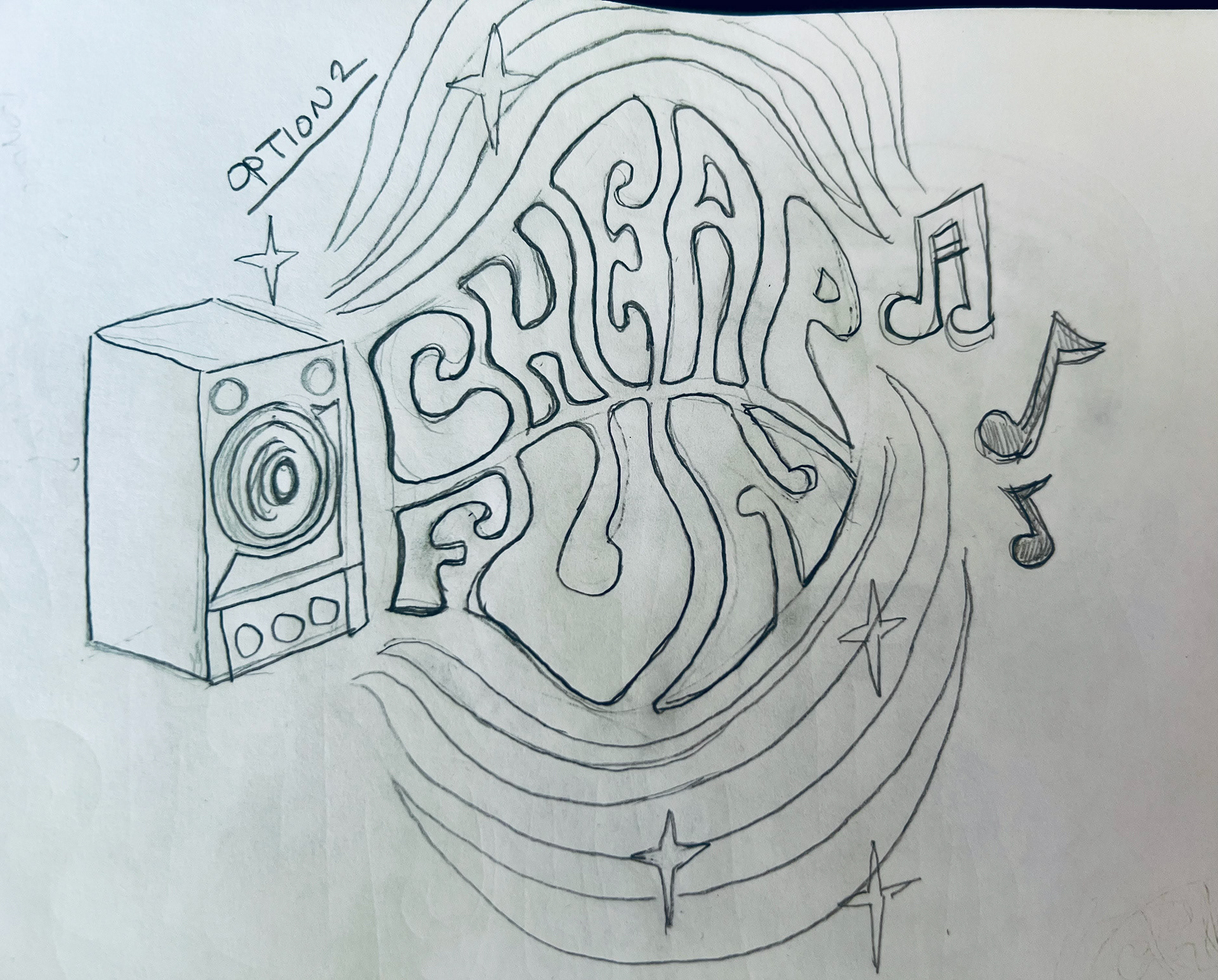
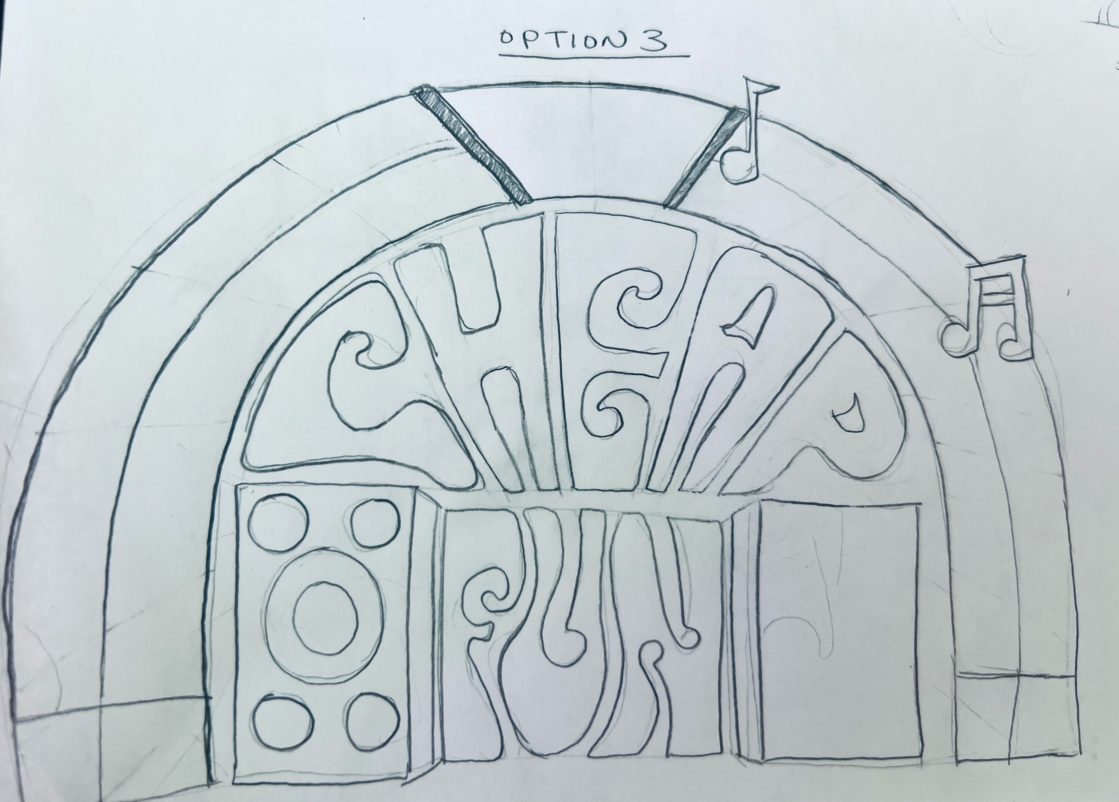
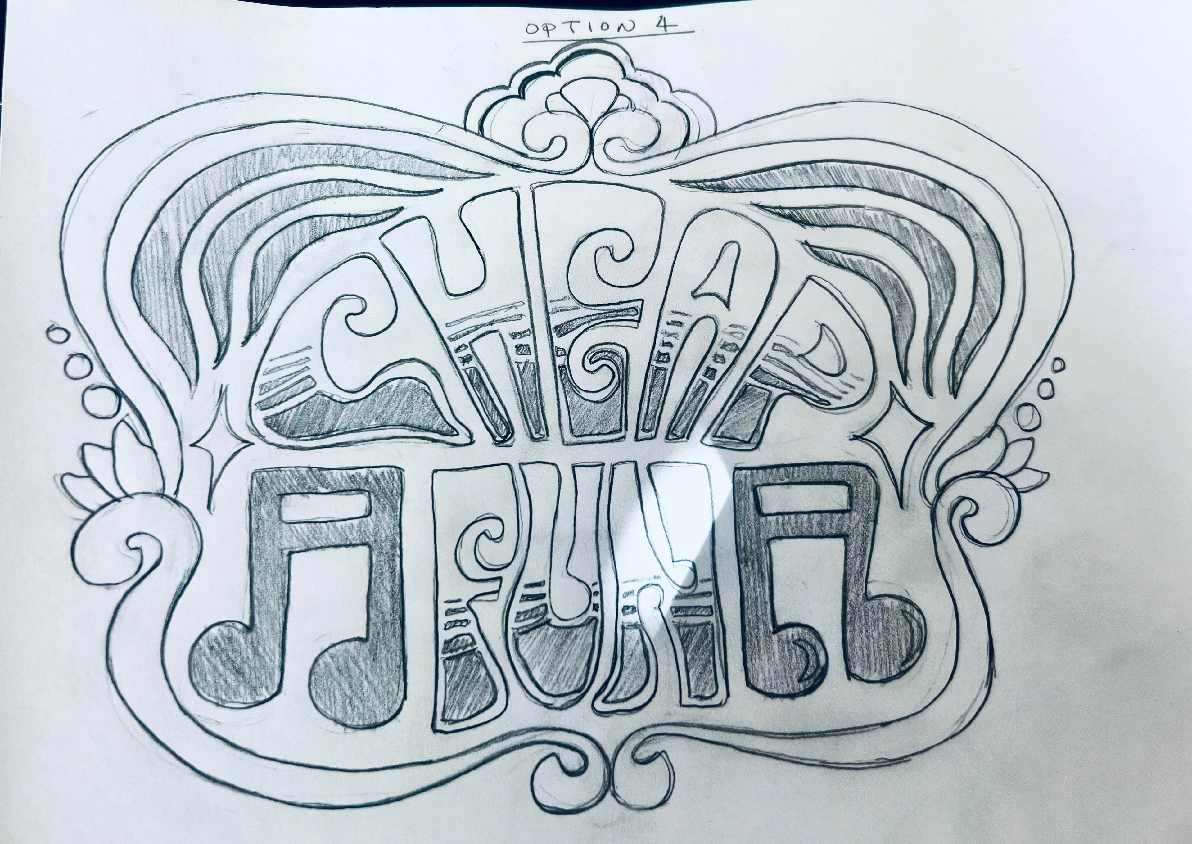
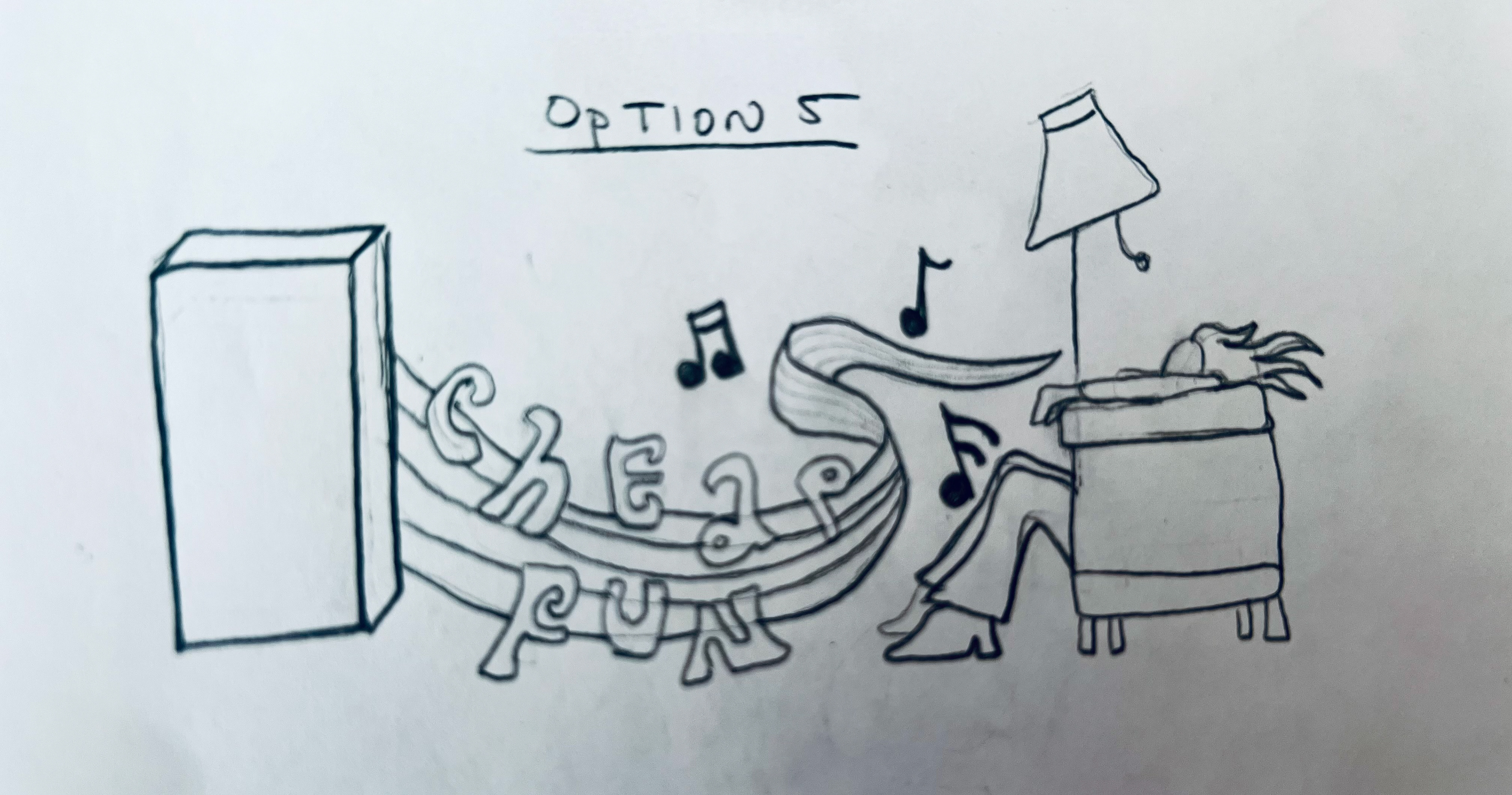
preliminary concept sketches + inspiration photo

SUMMARY
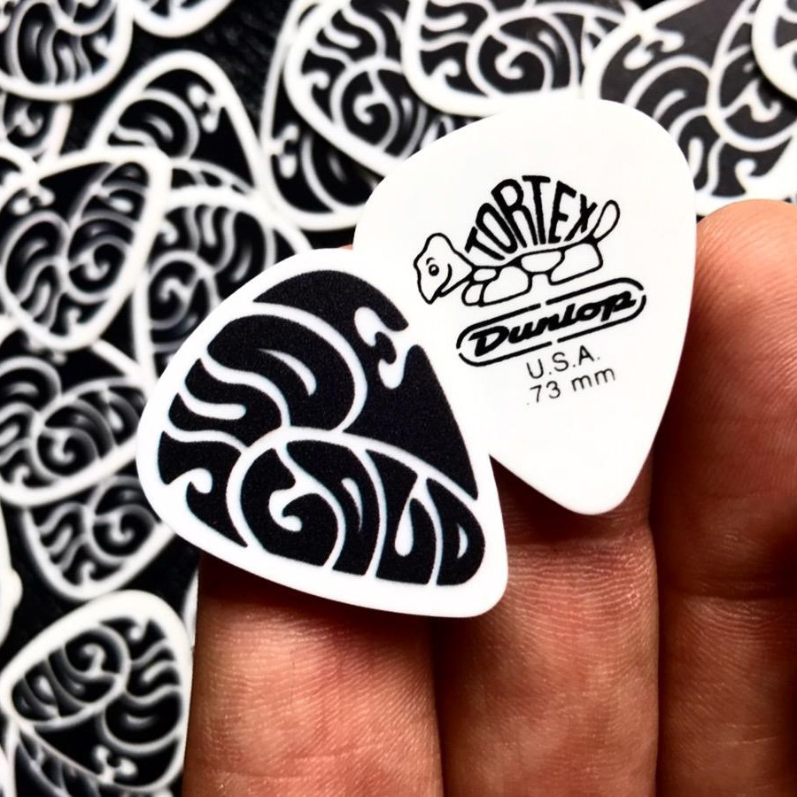
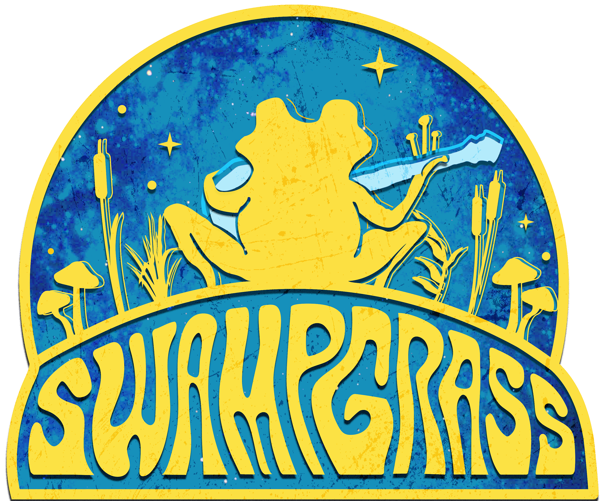
I developed a custom logo for DC-based bluegrass band Swamp Grass, creating hand-drawn lettering that captures the band’s distinctive sound and down-to-earth personality. The organic, expressive forms of the typography give the identity a handcrafted quality that feels at home within the traditions of bluegrass while giving the band a visual signature of its own.
To create a flexible identity, I developed two complementary logo variations: a typographic wordmark featuring the custom lettering on its own, and a secondary version incorporating an iconic illustrated image. The two marks give the band flexibility across applications while maintaining a cohesive and recognizable visual identity.
MEDIUM
Paper / Graphite / Adobe Illustrator / Adobe Photoshop
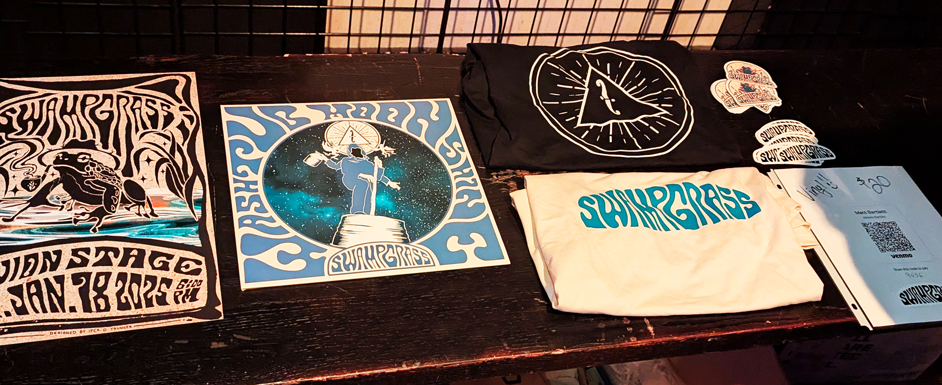
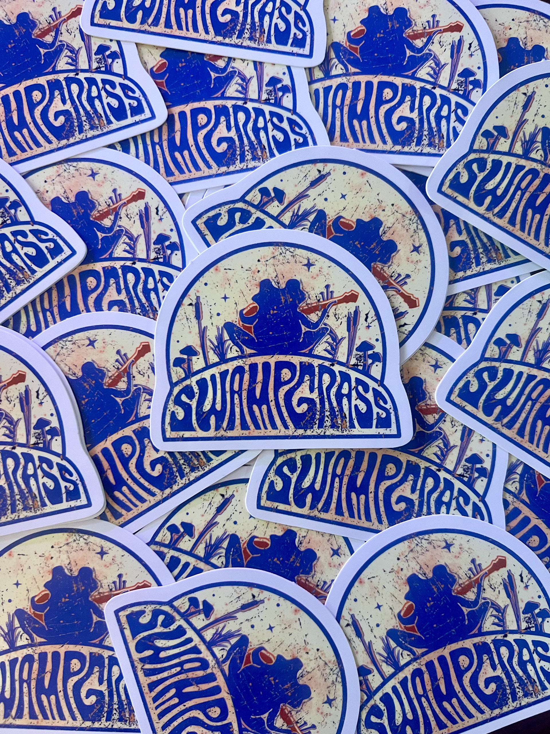
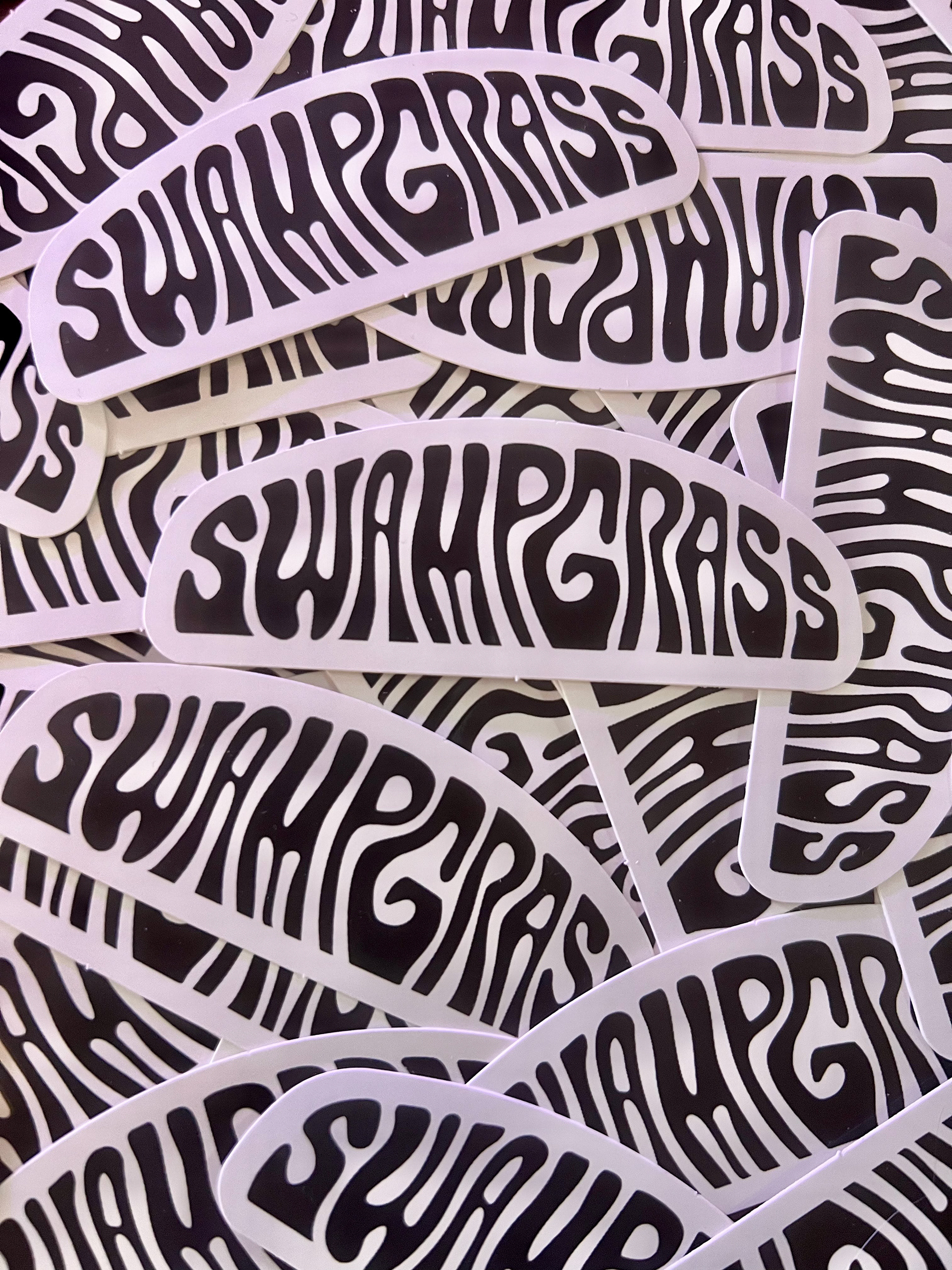
custom designed stickers and band merch

SUMMARY
Filiz Hair Design is a full-service, eco-conscious hair salon in Clarksville, Maryland, dedicated to providing exceptional beauty and hair-care experiences that leave clients feeling refreshed, confident, and rejuvenated. I had the pleasure of partnering with the Filiz Hair Design team to bring their vision and philosophy to life through a cohesive brand identity that reflects their commitment to beauty, wellness, and personalized service.
I developed the logo design in collaboration with designer, Aurora Davaz, as a visual identity that captures the salon’s welcoming and sophisticated personality, creating a consistent look and feel across a range of print materials.
The project included the design of the salon’s logo, business cards, and promotional brochure, establishing a polished and memorable brand presence that connects with clients both in and outside the salon.
MEDIUM
Adobe Illustrator / Adobe InDesign
logo design collaboration with Designer, Aurora Davaz
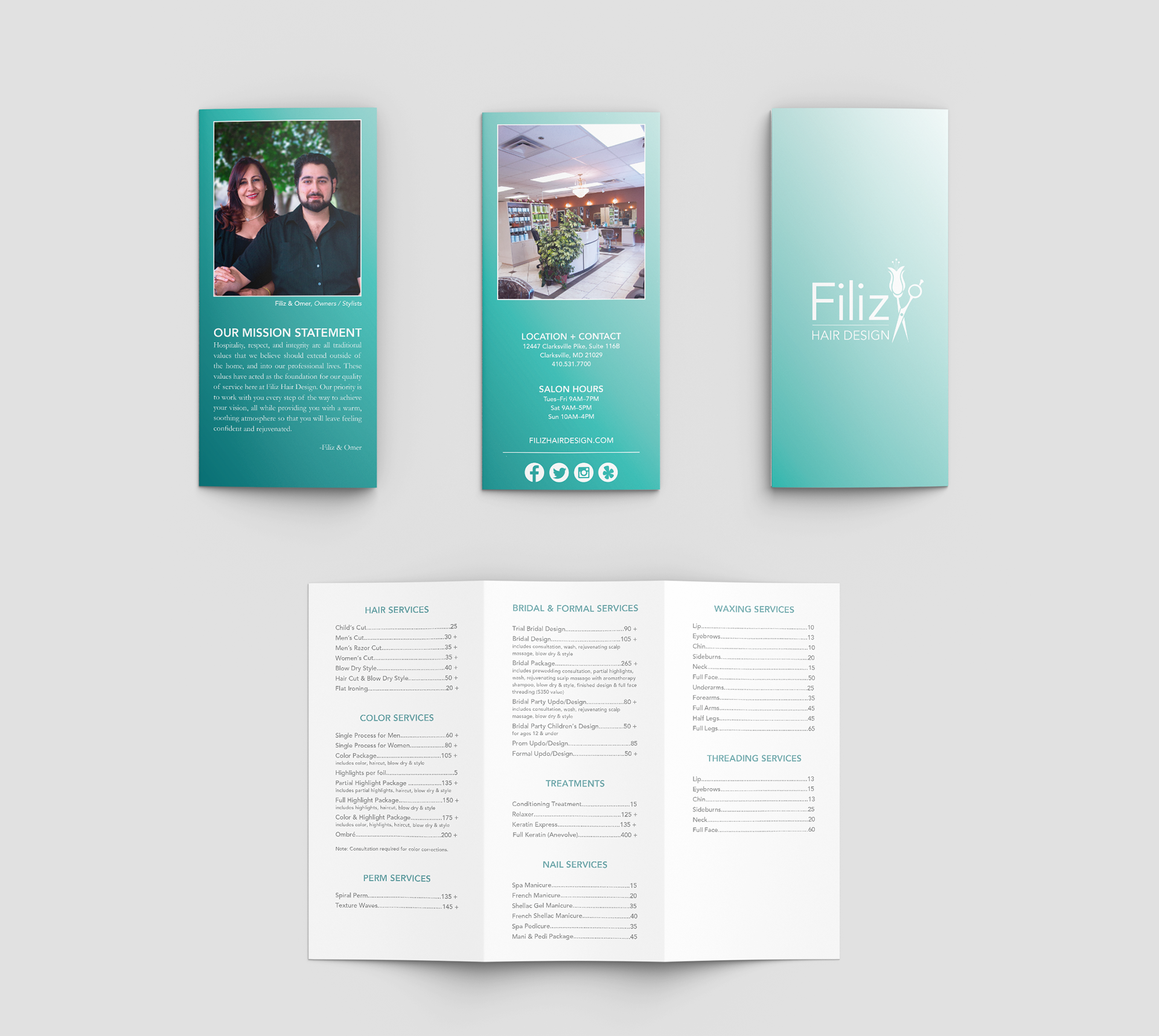
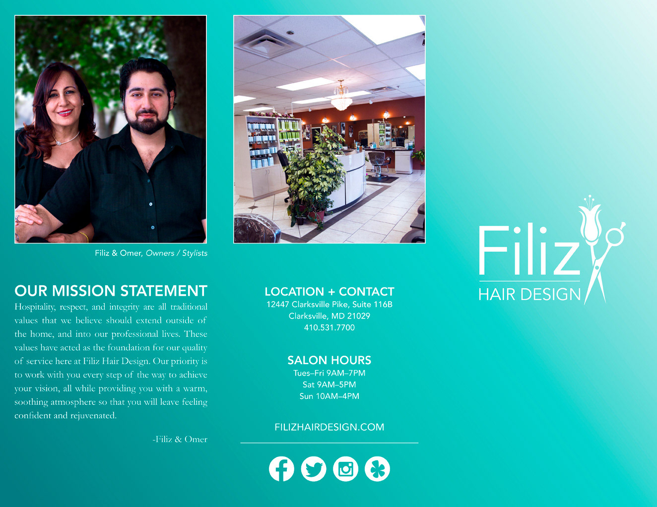
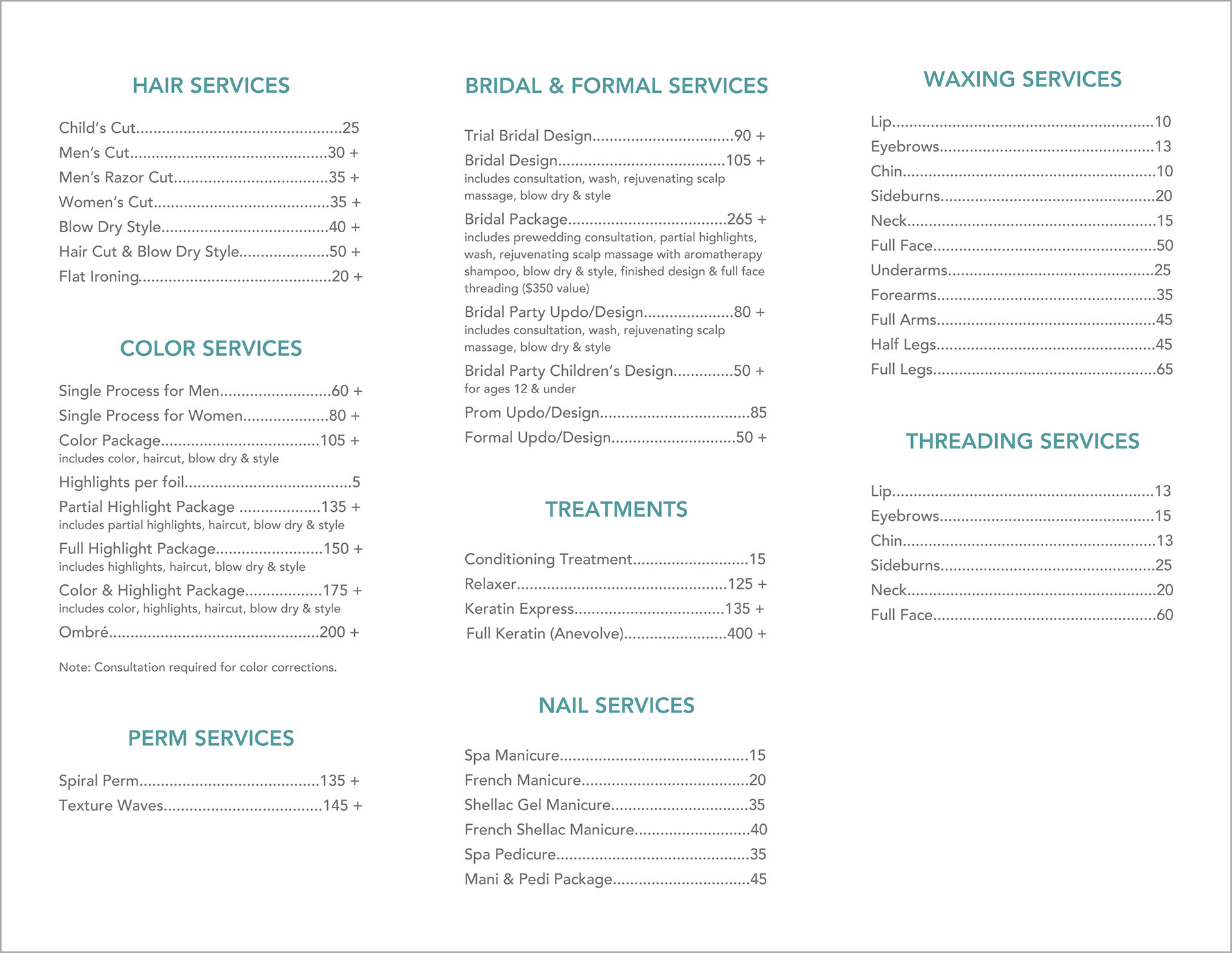
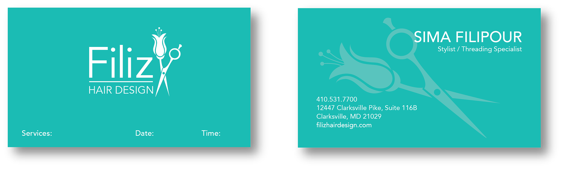
brochure and business cards
photography by Aurora Davaz

SUMMARY
Plum Tree Apartments is a conceptual branding project I developed in graduate school for an apartment community in Ellicott City, Maryland. The goal was to create a fresh, approachable visual identity that would stand apart from the property’s existing branding and appeal to a broad audience of prospective residents.
I created a new logo along with an illustration of "The Plum" family, giving the brand a distinctive personality and a memorable visual hook. I extended the identity across a series of print advertisements, including a quarter-page newspaper ad, half-page magazine ad, and full-page magazine ad.
To bring the concept to life, I combined the playful illustrations with actual photography of the apartment interiors and community spaces. This approach balanced personality with authenticity, allowing the campaign to showcase the property while creating a fun and engaging visual experience.
MEDIUM
Adobe Illustrator / Adobe InDesign

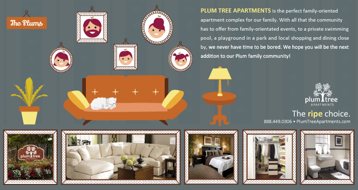
promotional full page magazine ad + half page magazine ad

SUMMARY
The Deadly Muppets is a Burning Man-affiliated theme camp known for creating a warm, eclectic space where people can gather, relax, and connect. For their Memorial Day weekend Gemini celebration in Western Maryland, the camp commissioned me to create a commemorative logo that captured the spirit of the event and its playful, communal energy.
The multi-day celebration brought together camping, music, art, fire performances, communal collaboration, and a candlelit four-course feast under the stars. I designed a distinctive event logo inspired by the celebratory and whimsical character of the gathering, which was then transformed into custom metal, glow-in-the-dark pins.
The pins were gifted to attendees as wearable memorabilia, giving participants a tangible keepsake to commemorate the experience and extending the event’s visual identity beyond the celebration itself.
MEDIUM
Paper / Graphite / Adobe Illustrator
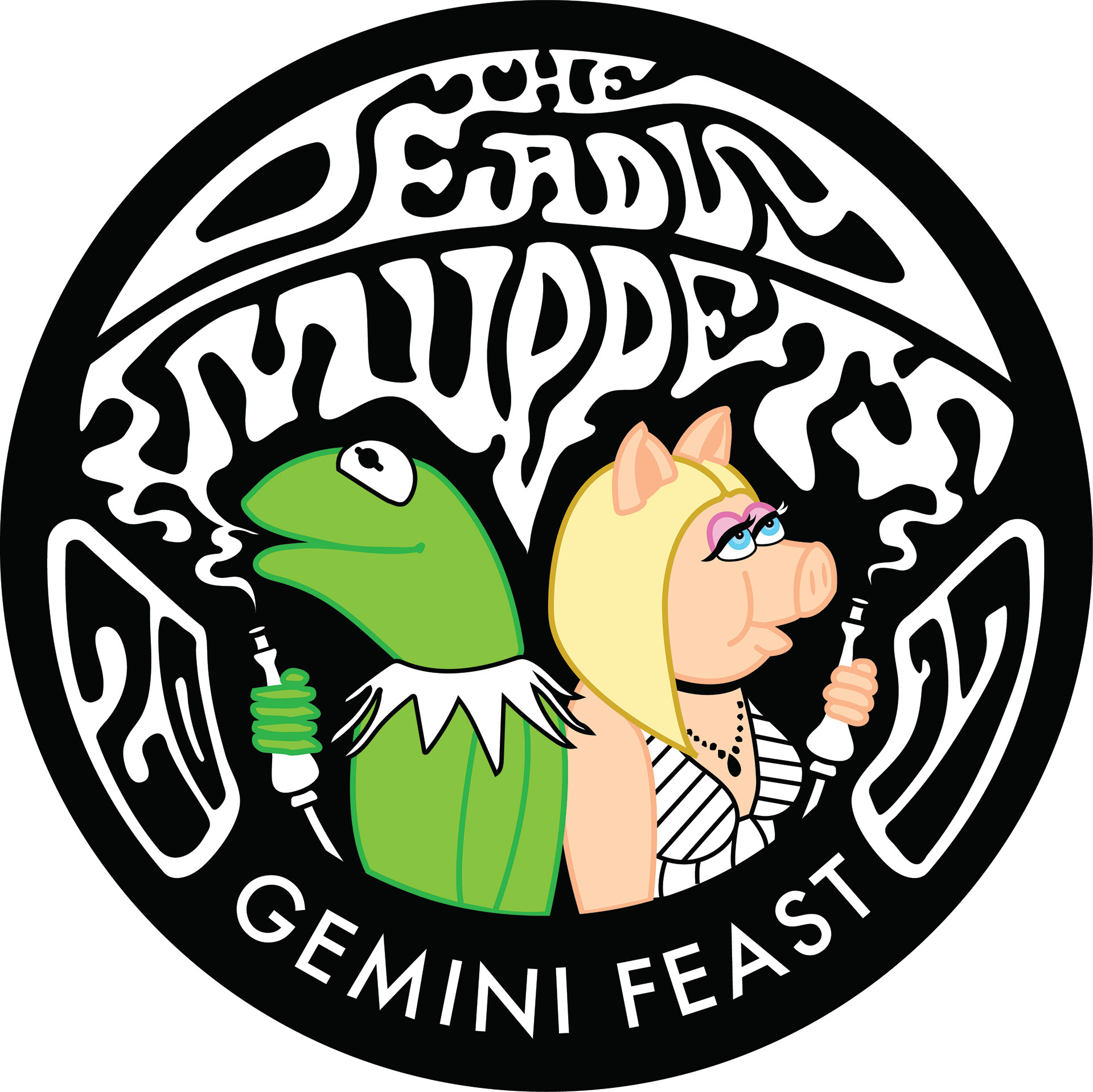
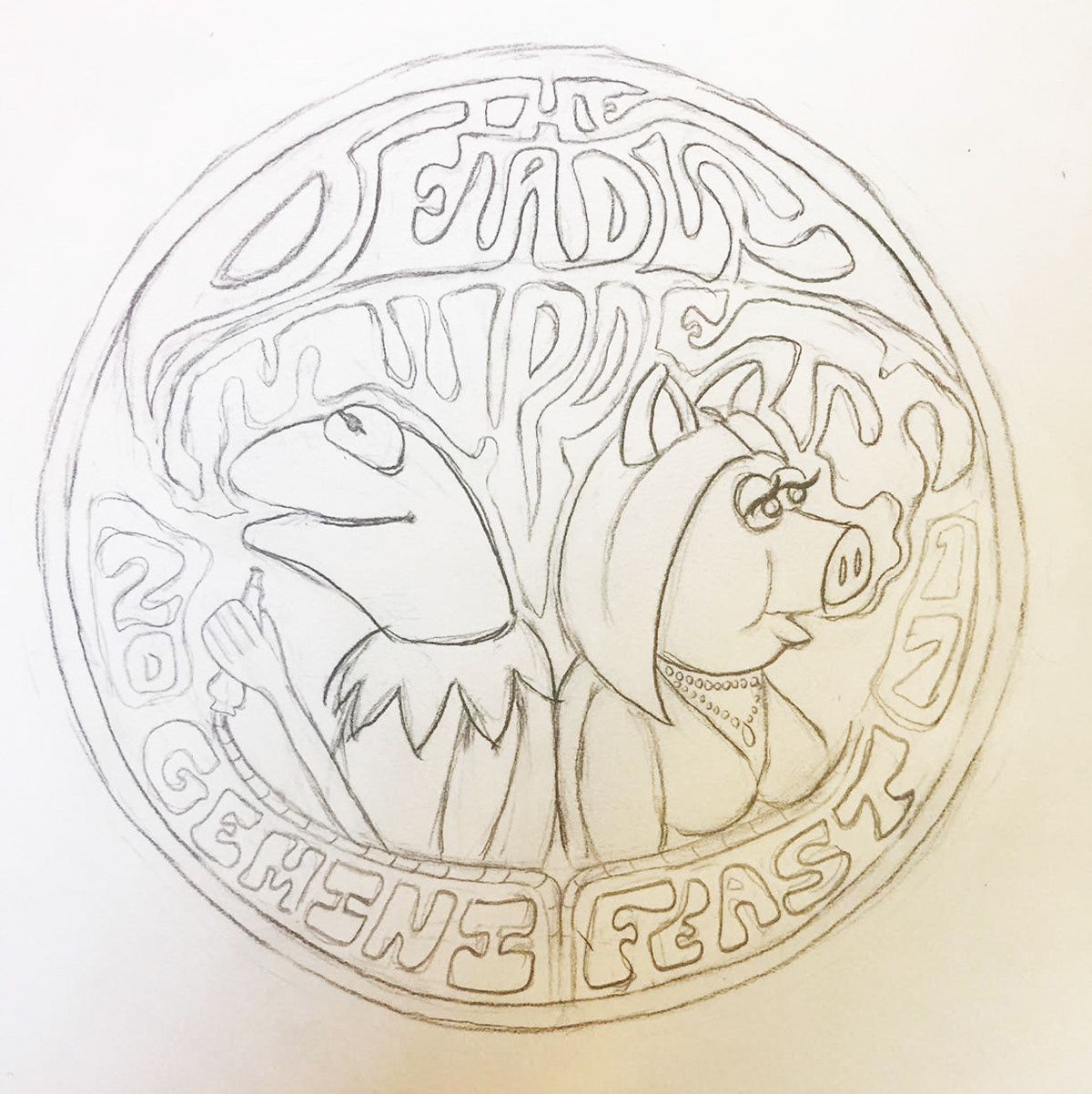
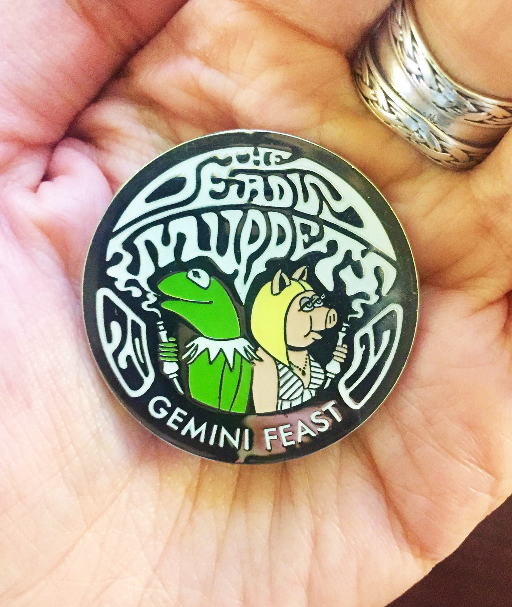
preliminary concept sketch + enamel pin

SUMMARY
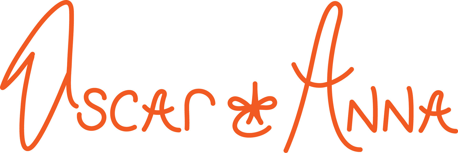
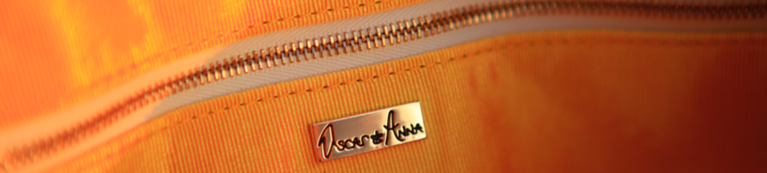
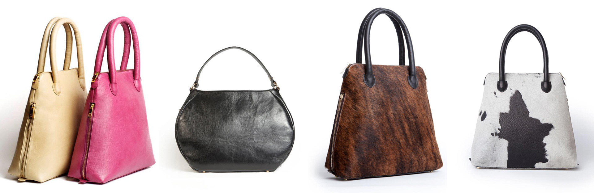
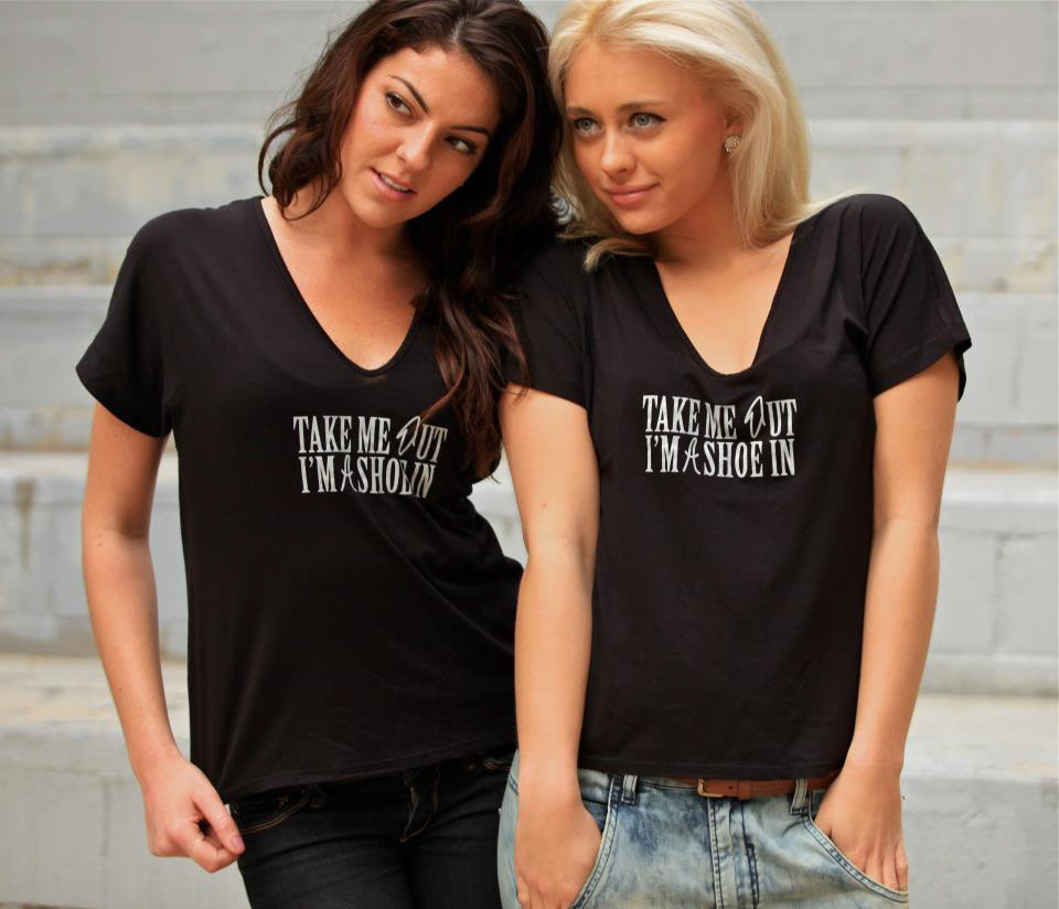
Oscar & Anna is a New York–based luxury leather handbag brand founded on the belief that a handbag should be both fashion-forward and functional—beautifully crafted to complement the person carrying it. Inspired by Anna’s beloved Vizsla, Oscar, the brand’s personality blends sophisticated craftsmanship with a sense of warmth and individuality.
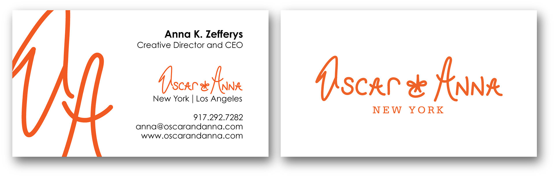
I began working with Anna in 2010, when Oscar & Anna was still an idea taking shape. As an early creative partner, I helped transform her vision into a cohesive visual identity, designing the logo, business cards, apparel, and a range of promotional materials.
The branding was designed to capture the refined, distinctive character of the handbags while giving the emerging company a memorable visual presence. It was especially rewarding to help shape the identity of a brand from its earliest stages and watch Anna’s vision evolve from a concept into a fully realized business. Equally rewarding, her handbag was featured in InStyle magazine and various other magazines.
MEDIUM
Adobe Illustrator / Adobe Photoshop

SUMMARY
Whimsical Beans is a conceptual coffee shop created in graduate school around a simple philosophy: never lose your sense of childlike wonder. Imagined as an eccentric and playful neighborhood café, Whimsical Beans pairs thoughtfully crafted coffee with an unforgettable experience designed to spark curiosity, delight, and a little everyday magic.
I developed the brand identity to bring this imaginary coffee shop to life, creating a visual world that feels colorful, quirky, and full of personality. The project explored how branding can transform an idea into a tangible experience—even when the business itself exists only in imagination.
For now, Whimsical Beans exists solely in my mind and in its branding—which, I like to think, is a pretty good place for a whimsical idea to begin.
MEDIUM
Adobe Illustrator / Adobe InDesign
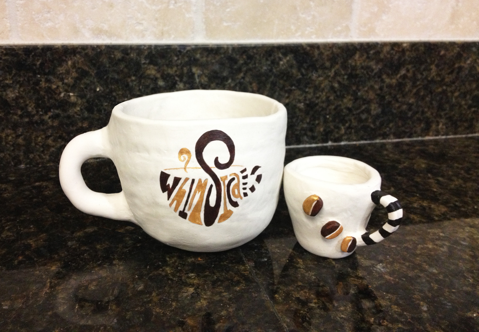
hand-crafted / painted Whimsical Beans mug and espresso cup
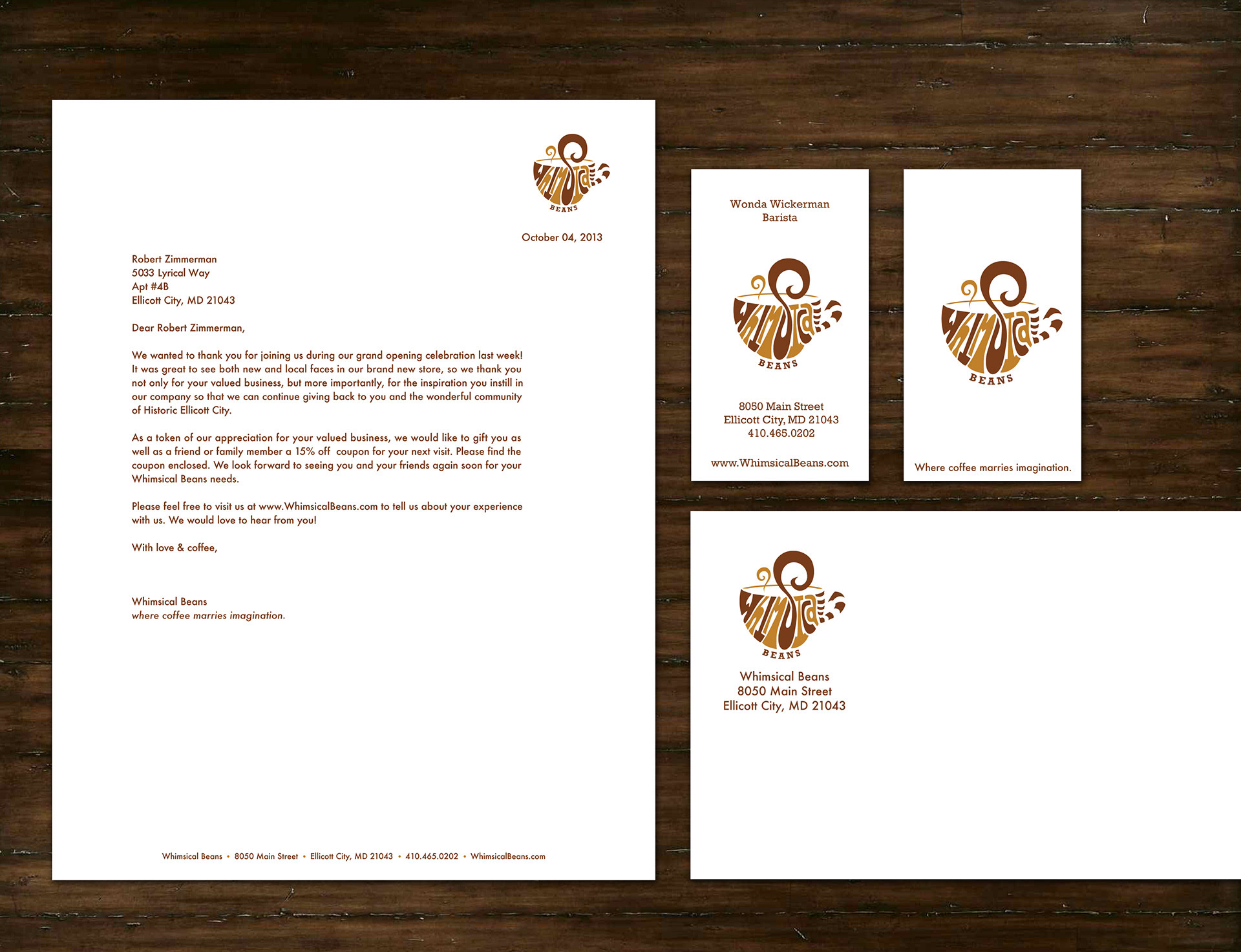
company letterhead, envelope and business cards
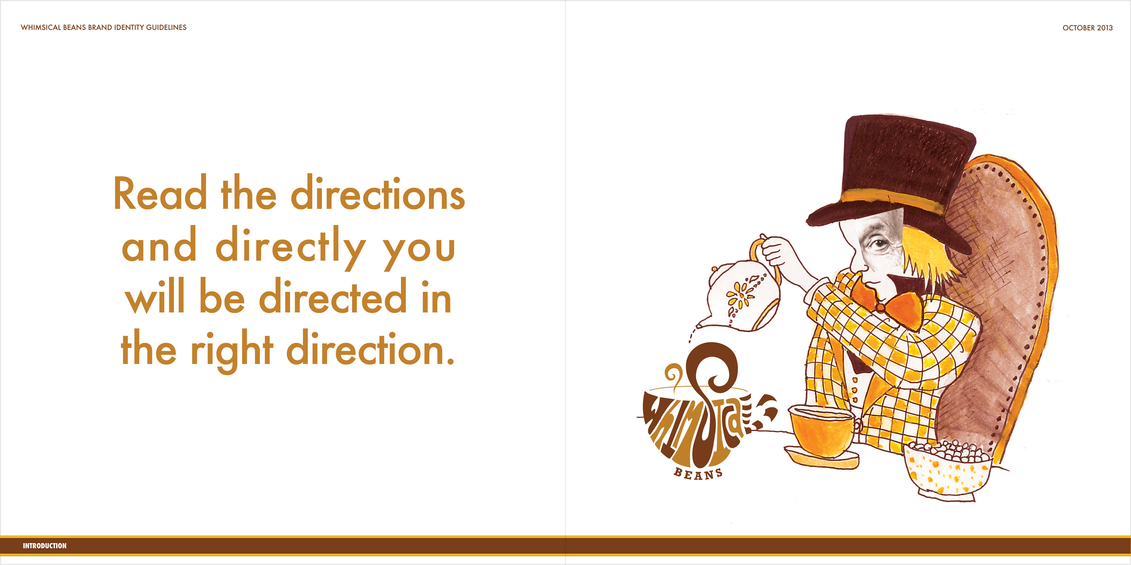
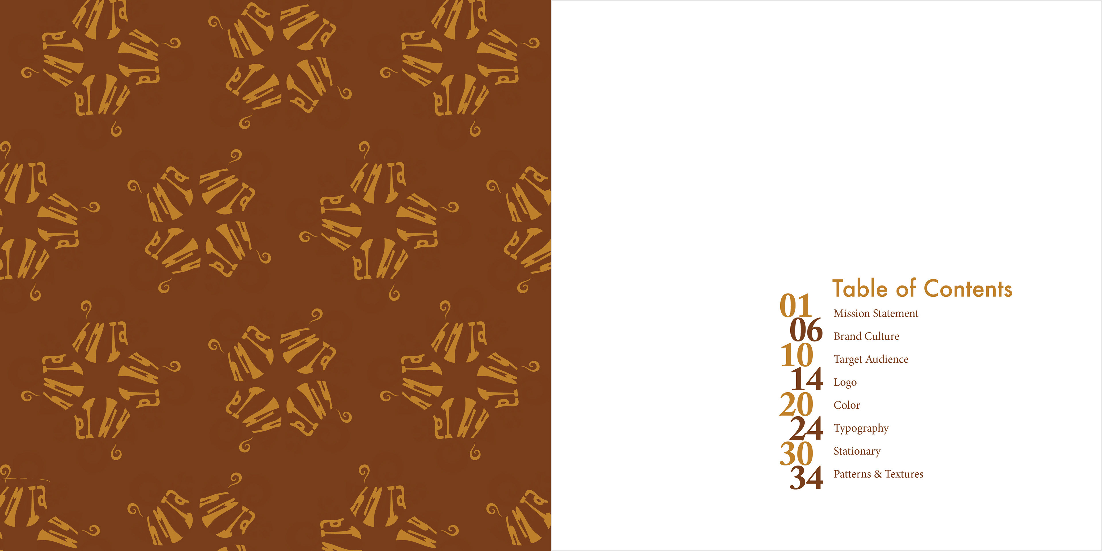
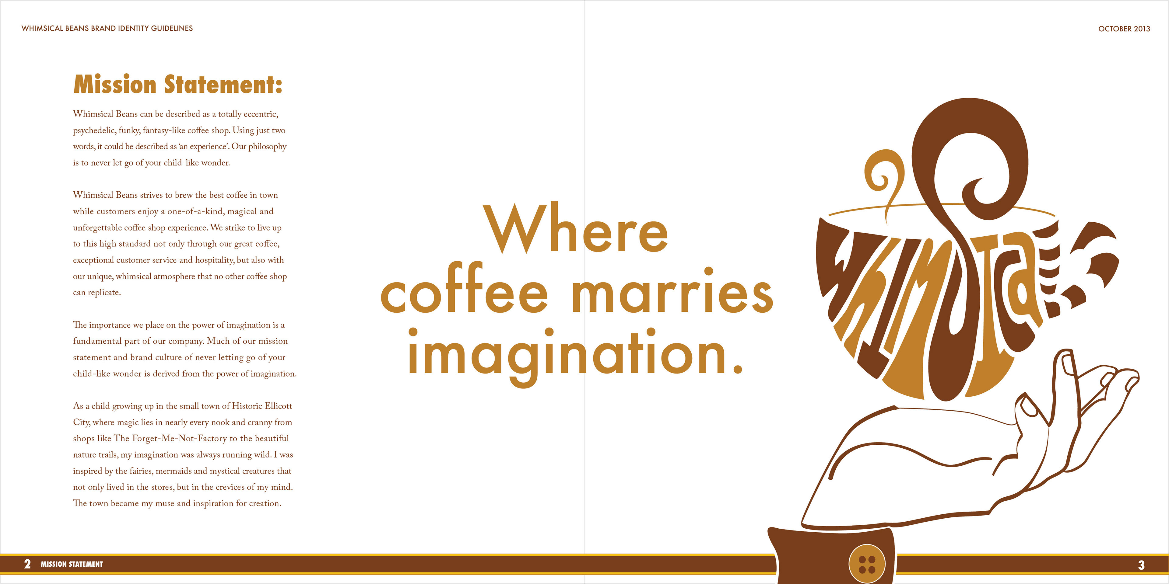
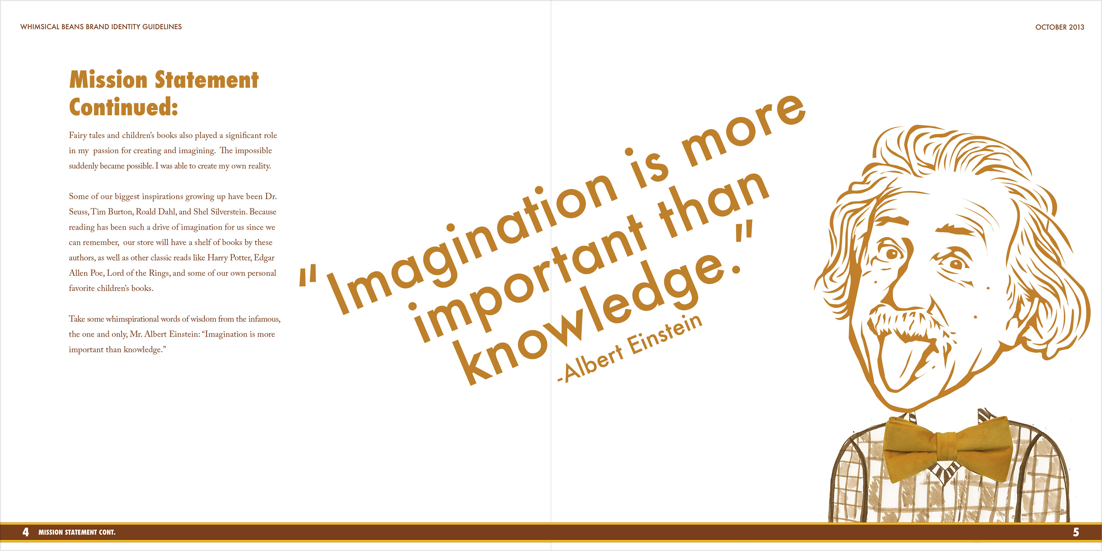
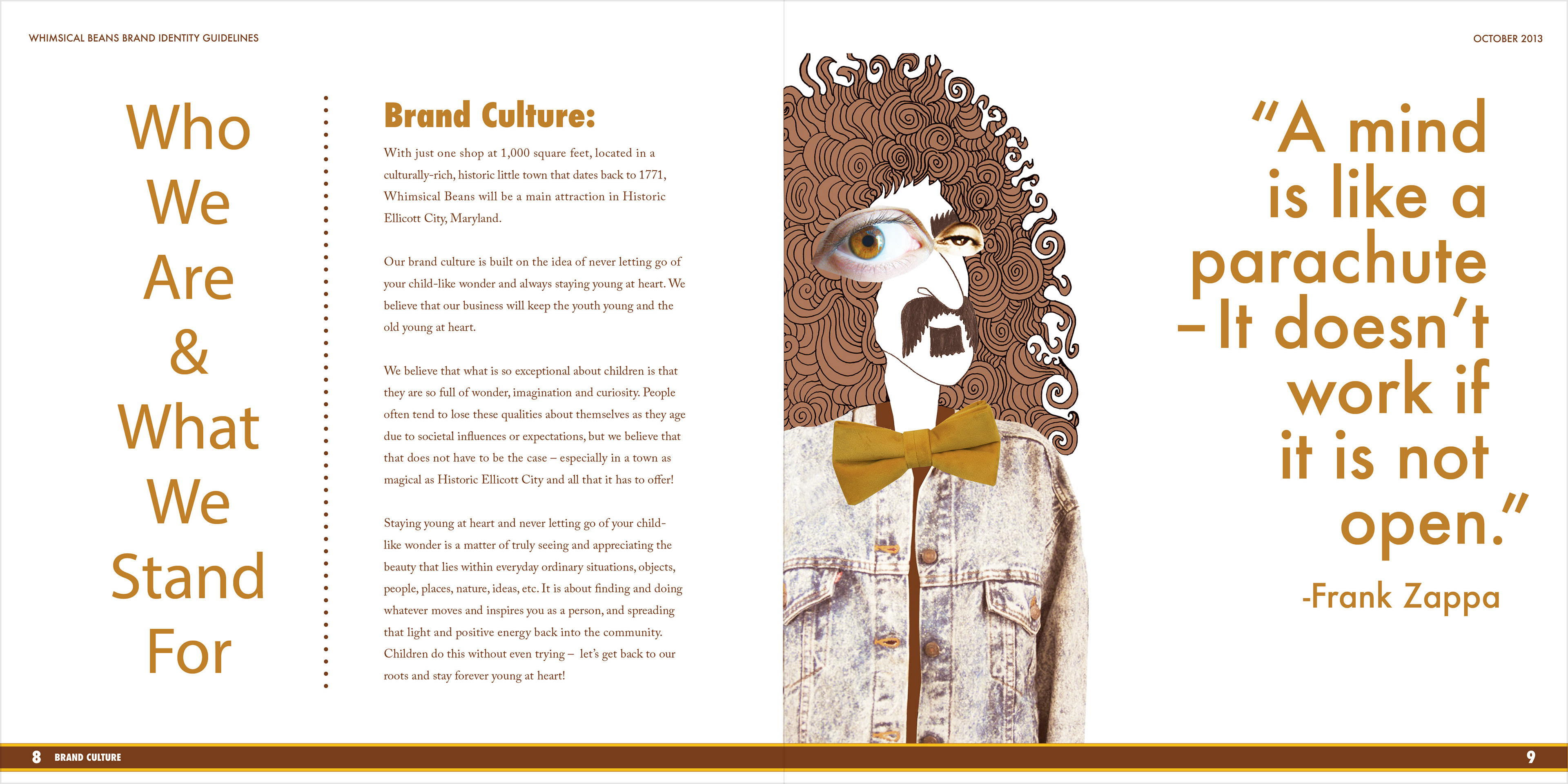
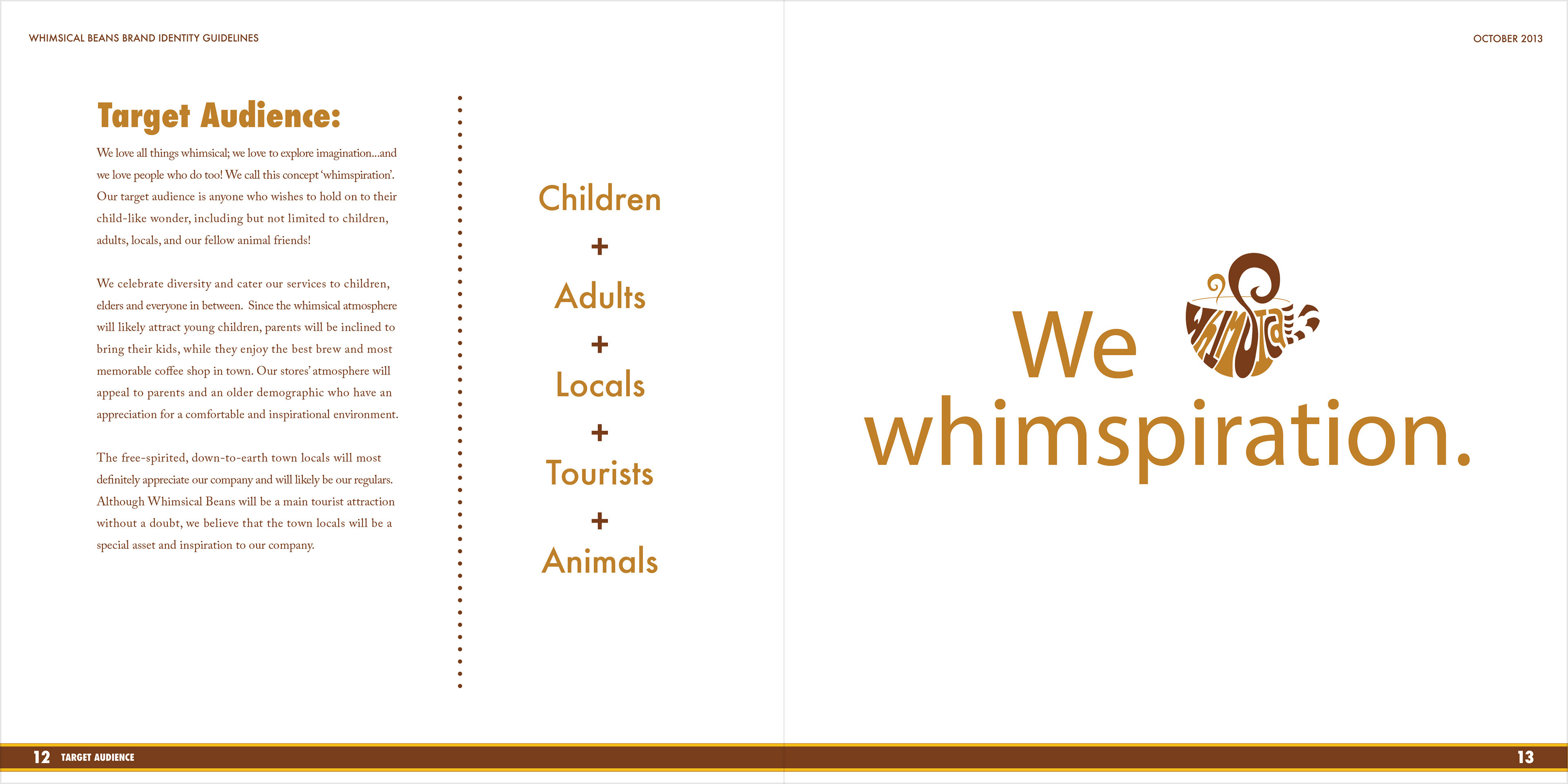

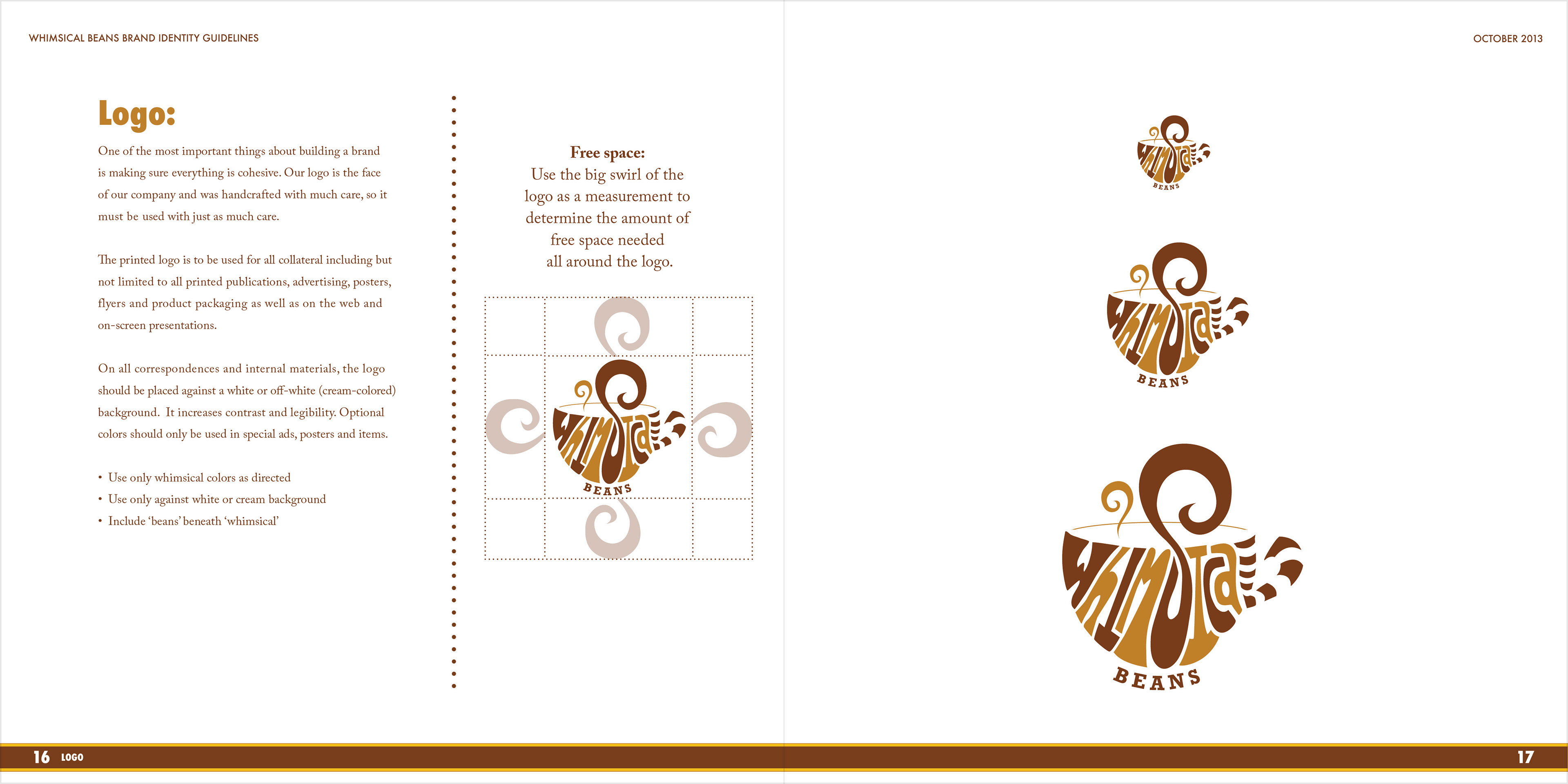
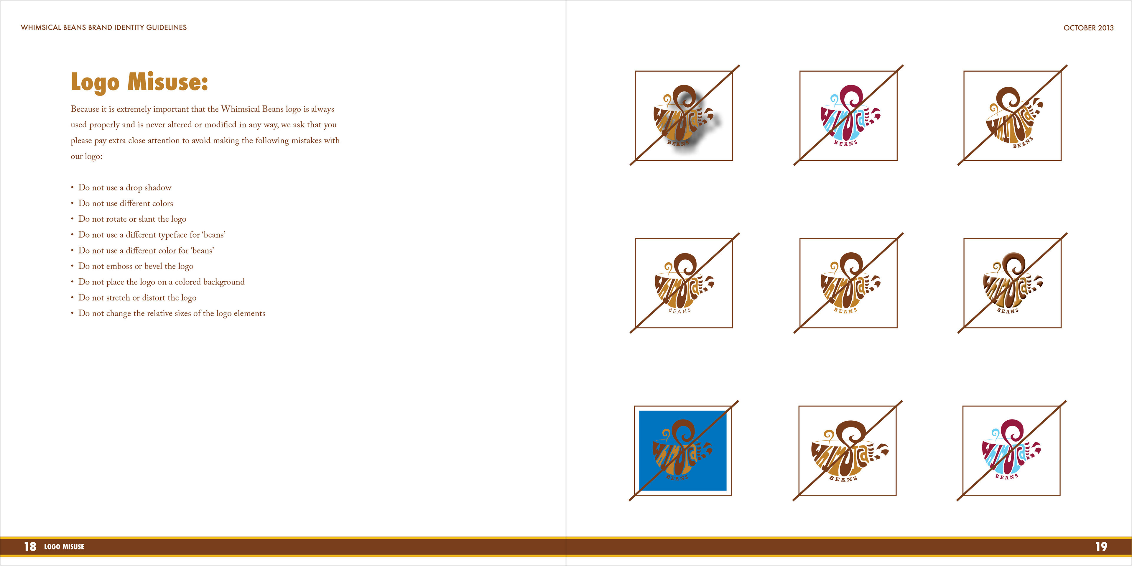
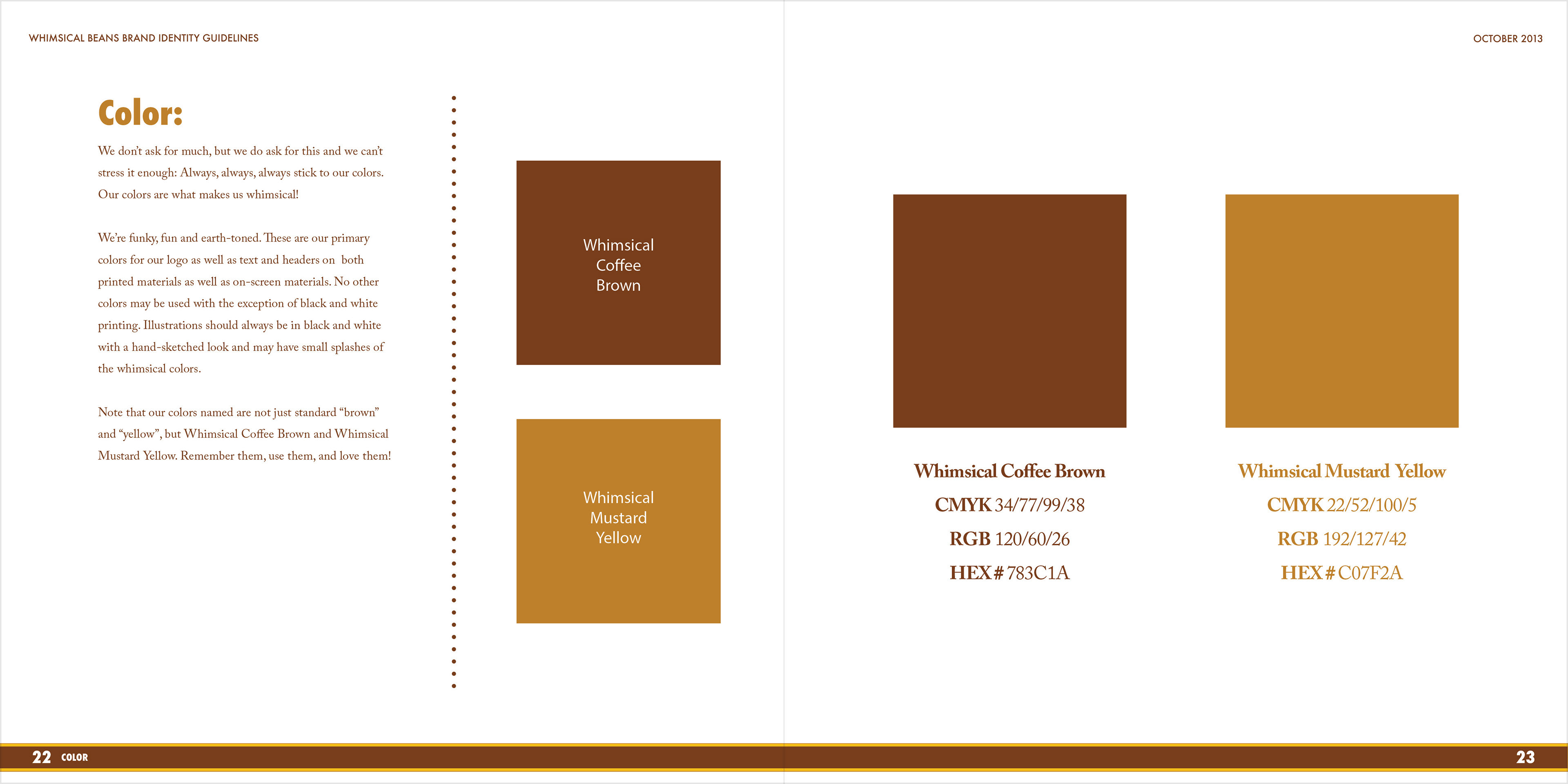
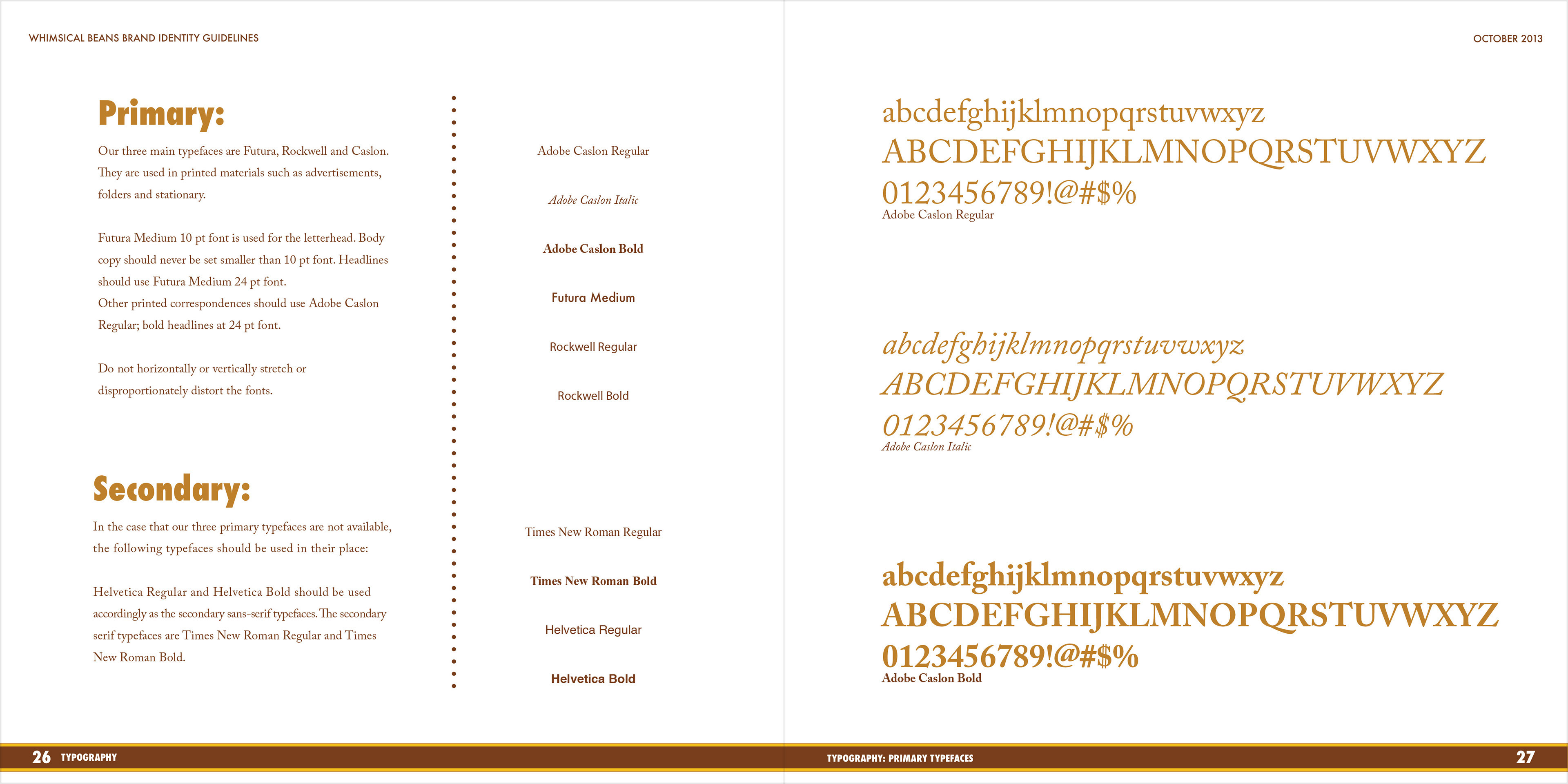
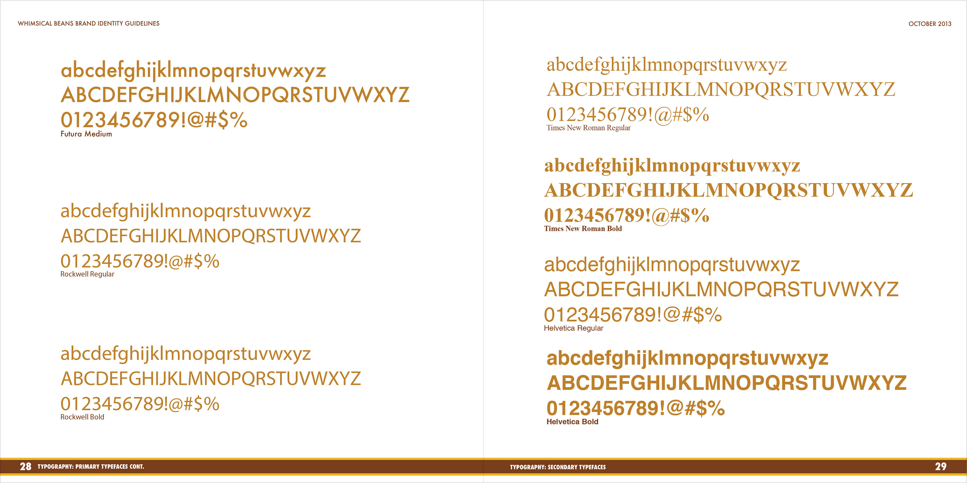
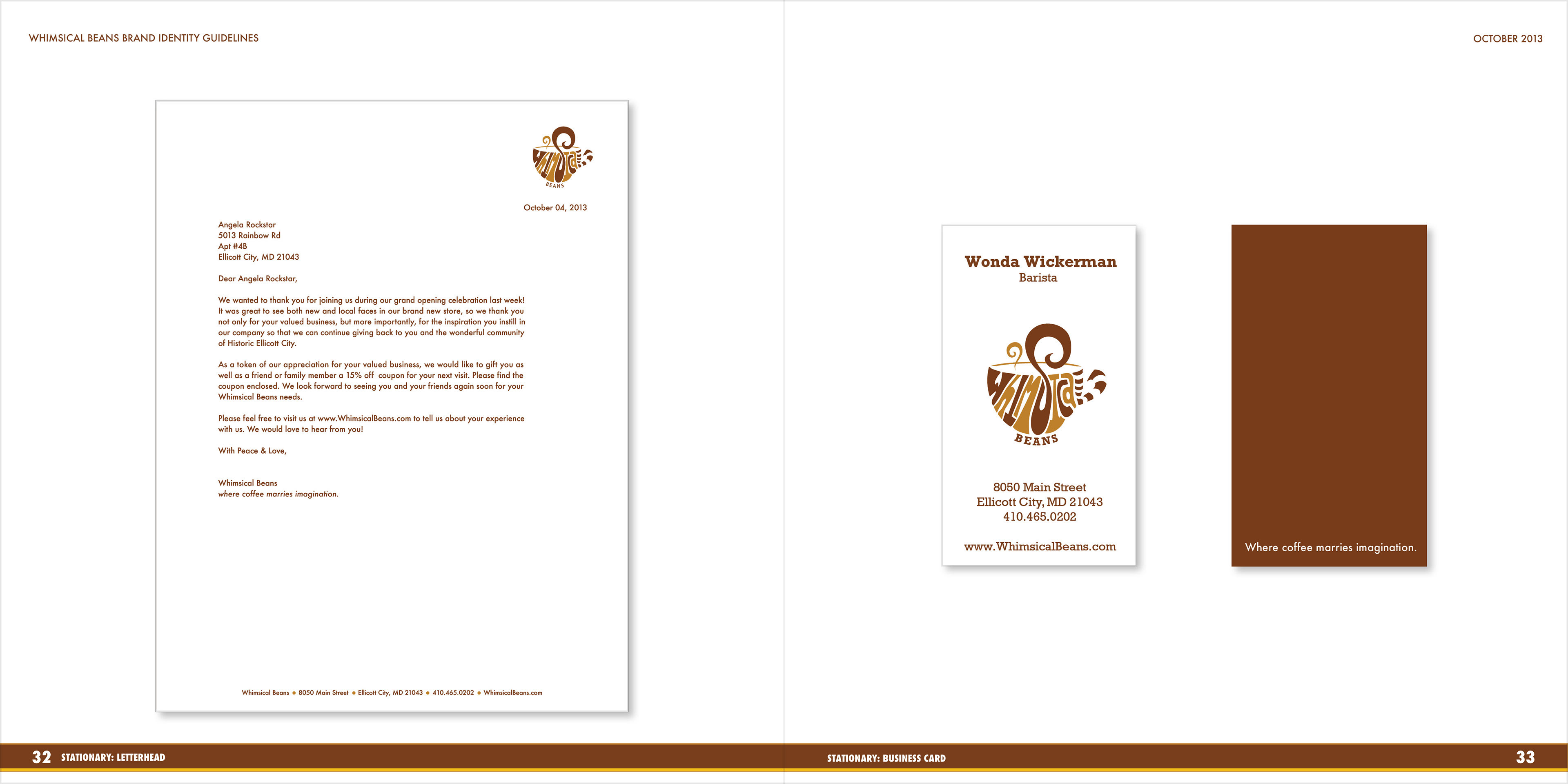
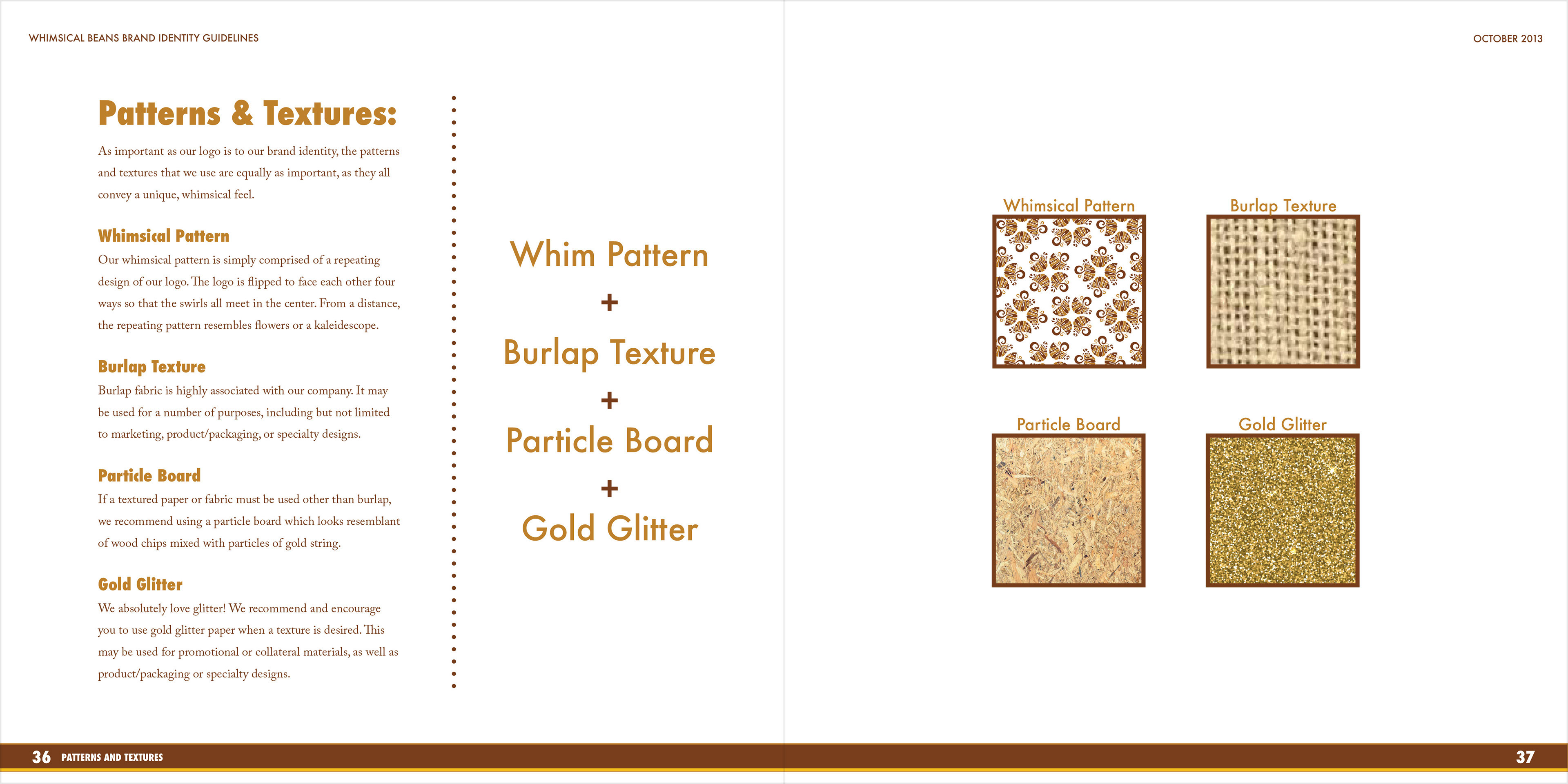
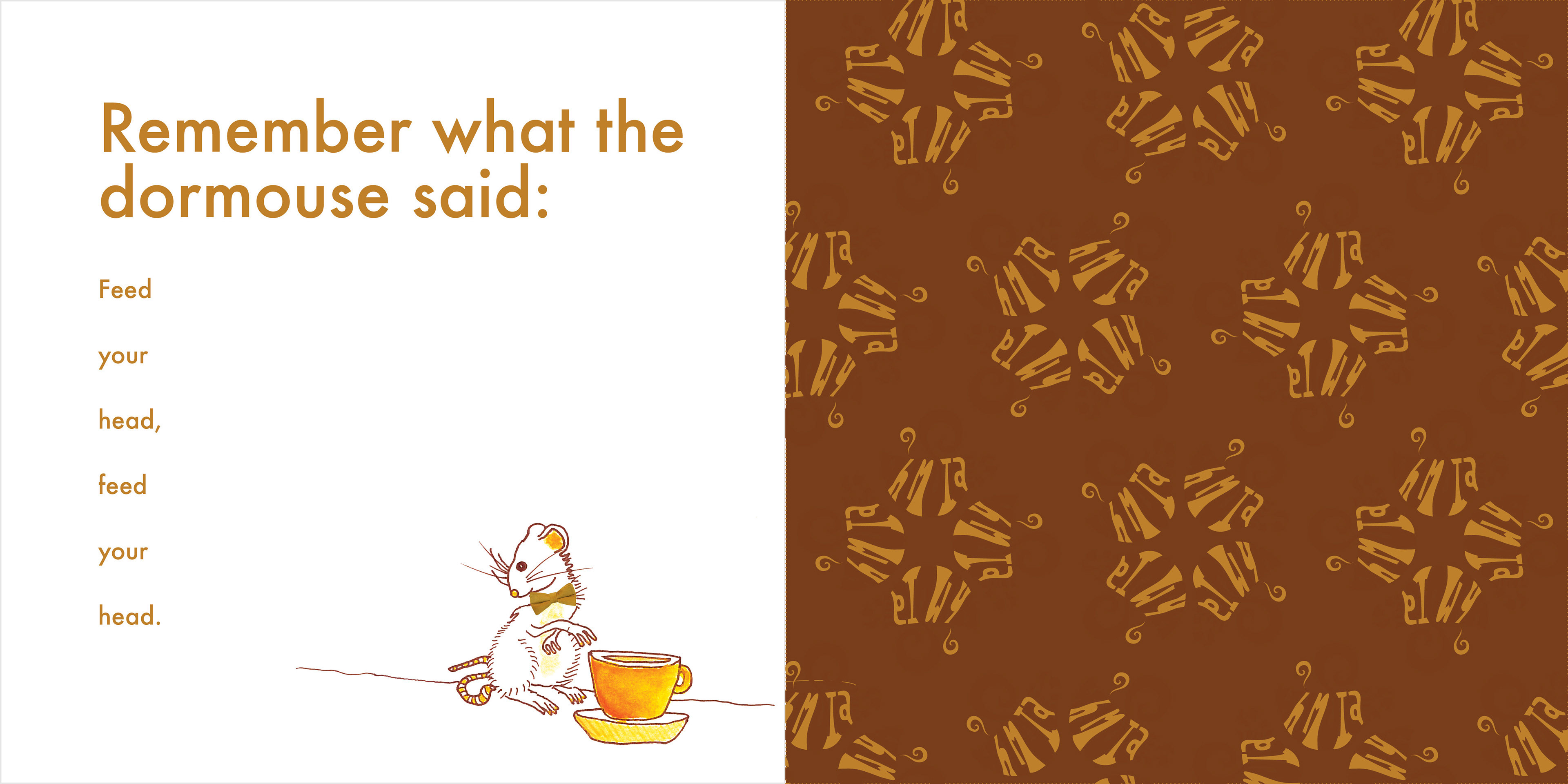
company brand guidelines
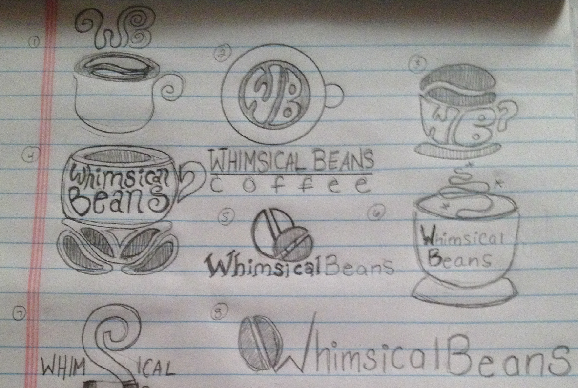
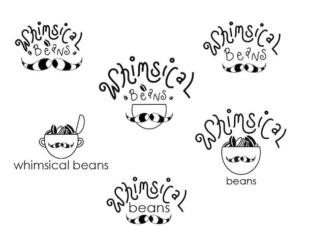
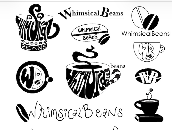
preliminary logo concept sketches